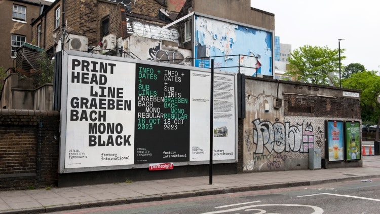
Design studio North and Peter Saville have collaborated on creative events organisation Factory International’s identity, designing an evolving logo based on the architecture of its new Aviva Studios venue.
Factory International commissions, produces and presents a year-round programme of original creative work and special events at Aviva Studios – its new home in Manchester – online and internationally through a network of co-commissioners and partners. It also stages the city-wide biannual Manchester International Festival (MIF).

North and Saville have been working on the visual identities for both the MIF and Factory international since 2018. This October marks Factory International’s first public performance – titled Free Your Mind – as well as the official opening of Aviva Studios, which was designed by OMA partner and lead architect Ellen van Loon.
North partner and creative director Jeremy Coysten says Factory International is “building on the creative heritage of Manchester, inventing new work and working with local communities”, so the identity looks to combines the city’s heritage with the legacy of MIF and Factory Records, which was founded in 1978. He notes that “a complexity to the brief” involved taking the “established MIF brand and evolving it into an organisation which will operate the largest public investment in a cultural building since Tate Modern opened in 2000”.

Factory International’s new logomark is an abstract depiction of Aviva Studios. Coysten says the building’s “flexibility” inspired the symbol and its use and that the design team were “not afraid to mess with it” as they wanted to avoid “sticking it in the corner with an exclusion zone”.
The symbol also references a previous Factory Records logo, a symbol of a Factory, and in the future the icon will continue to evolve “but always revert to the original form”.
Two of the main challenges with the project were a name change halfway through the process and negotiating “a building naming rights partner with Aviva very late on”, according to Coysten. The Aviva Studios symbol had already been trademarked and was “a hugely important asset” shared by both Factory International and Aviva Studios, says Coysten, and appears predominantly on uniforms and inside the building.
He explains how it “glues the elements together”, adding that “if the identity was reliant on an expressive logotype, as other routes we developed did, then we would have had to go back to the drawing board”.
North and Saville opted to use the same font family that is used for MIF. Cemelot had just release a monospaced version of the font, according to Coysten, which had “a machine-like functionality” that felt “appropriate for a typographic system”. He says “the angularity of the mono font works well with the angularity of the symbol”, explaining that the biannual festival will occupy Aviva Studios, so “the typographic voice needs to align”.

When working on MIF 2019, North and Saville went for a “one-colour approach” using a hue called Column Coral, says Coysten, and for 2021, opted for Machine Green. These two colours became lead colours for the Factory International identity, adding hues like Pigeon Blue – “the main colour that Ben Kelly used in the Hacienda” – Urban Purple and Tooling Bronze “for balance and vibrancy”, Coysten adds.
Factory International’s brand guidelines use the format of four-sheet fly-posters, reminiscent of paste-up street posters. Coysten believes that fly-poster communication adds “a texture to the city” that “has always been prevalent in Manchester”.

He stresses that the design team “didn’t want just another PDF” and the guidelines will be printed and appear inside the building, “celebrating the identity assets”. Paste-ups are being used in other areas for wayfinding, Coysten adds, to bring “the street communication style” into the building.
North met with van Loon and Saville early in the process to discuss signage concepts, deciding that they didn’t want “an over-engineered and costly signage system for wayfinding getting in the way of the visitors’ experience”, says Coysten. Instead, the team chose “a few lo-fi long LED screens to support the building’s flexibility” and the different events it might house.

- Design disciplines in this article
- Industries in this article
- Brands in this article


One response to “North and Peter Saville design evolving identity for Factory International”
On just a tiny glimpse of this collaborative project, I look forward to seeing more.