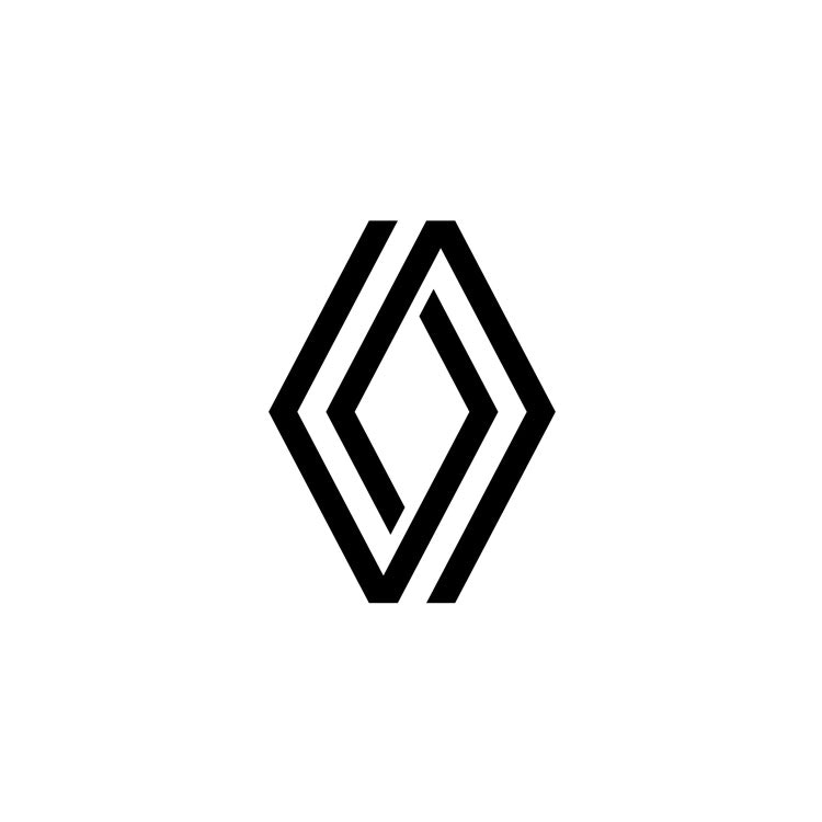
Renault has revealed a new logo, a geometric version of its diamond-shaped design which has been in use since the 1920s.
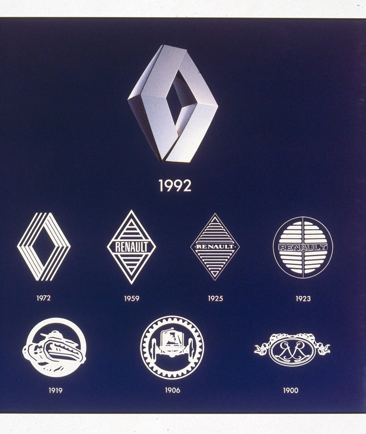
While the brand’s diamond logo has existed since 1925, the previous iteration had not changed significantly since 1992.

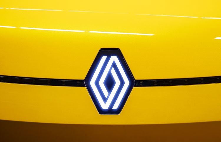
The new flat logo comprises two intertwining diamond shapes which can be animated for digital media. It appears without a wordmark and can also be lit-up on vehicle grilles.
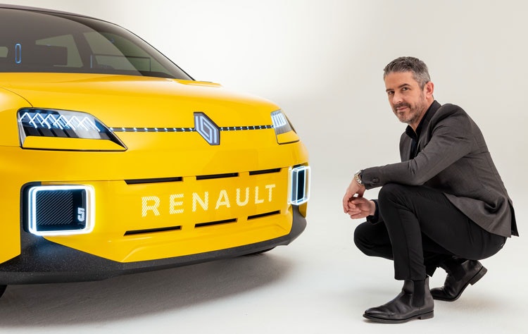
The new logo was designed in-house at Renault and hopes to meet the needs of a modern brand in a digital world, according to the brand’s design director Gilles Vidal.
“It is a simple geometric shape, with a strong, powerful identity,” he says. “The challenge was to renew this shape by giving it meaning, new contemporary values to project the brand into the future.”
“Symbol of the future”
Vidal says that the “symbol of the future” strikes a “balance between recognition of the brand’s heritage and entering a new era”. It also seeks to accompany the changes at the marque, Vidal explains, as Renault expands further into the fields of electrification and wider mobility.
The black and white logo appears without any of the typography that has appeared on previous versions. “We have rethought it to become more iconic, simple and meaningful, a true timeless signature,” the designer adds. It will become an “essential part of our graphic heritage”, Vidal says.

The geometric logo “perfectly embodies the ‘New Wave’ era that Renault has entered”, the designer says. He adds that the design is a call back to Renault’s logos in the 1940s, 50s and 70s when the marque used a line to add detail to the logo.
“With the line, it is a question of telling a story, that of a symbiosis, a cycle, a path between two lozenges which are intertwined by an optical effect, creating a complementarity and the impression of continuous movement,” Vidal says.

Many car brands have revealed rebrands recently, with many marques making use of flat design. Renault makes use of this treatment too, explaining that it can be animated for video or digital media and also in vehicles as part of the welcome sequence, for example.
The brand also revealed its ‘Renaulution’ strategy earlier this year, which outlines its ambitions over the next few years. It hopes to make headway in electrics and explore new avenues in the data and mobility sectors.
By 2024, the entire Renault range of vehicles will bear the new logo, according to Vidal, and it will start to appear on vehicles from next year. The new logo can be seen on the grille of the Renault 5 prototype, where the headlights appear to echo the geometric design.

What do you think of Renault’s new logo? Let us know in the comments below.

- Design disciplines in this article
- Industries in this article
- Brands in this article


10 responses to “Renault unveils new geometric logo in “timeless” rebrand”
I like it a lot… has very much the same feel as Volkswagens new ‘restyle’ and what they have done. The ‘Renaulution for the Diamond’ video presents very well some of the potential and its versatility, interesting to see how it indeed evolves. Not sure about that Renault 5 prototype though, nice idea, again in the vein of the Fiat 500, but…
It’s a great logo redesign for the “electrified” automotive brand: self similar to the brand DNA, simple to grasp, complex but not complicated, dynamic and robust enough for various applications.
Renault unveils – “A major redesign of its diamond-shaped logo since 1992” – with, amazingly, a diamond-shaped logo.
A strong, simple logo instantly identifiable as Renault, but I much prefer the softened corners you can see in the illuminated badge which seem to be lost in the final logo.
Great classic simplicity that will translate across media. Would make beautiful jewellery for example, such as silver ear-rings. Would work well in repeat textile pattern, embossed or debossed in leather, paper or card.
Perfection is achieved not when there is nothing more to add, but when there is nothing left to take away.
Love it; it’s much more modern and distinct. The thing is, if I ordered a new car now, one that’s about to be built, I would fully expect it to feature this more visually pleasing logo. Why would a company announce something like this and at the same time effectively be saying: anyone who buys our cars for the rest of the year will be fobbed-off with the old, dated, anonymous-looking logo? That is Renault all over, going by my experience of their customer service.
I love it. It’s a real statement that Renault is ready for the future of the industry in electric, and it’s leaving behind a plethora of industry norms and traditions. It’s brave, it’s beautiful and I’ve love to see where it pushes the design language of cars over the next decade.
Digitising a car brand could lead us on a new path, much like the first LED or cathode head/tail lamps did. As a designer, I’m excited for it.
However, as a petrol-head, a part of me is disappointed that the regality of a badge has gone. Driving around with your car with the chrome emblem front and centre was a huge part of passionate car ownership, be it Jaguar, Mercedes, Nissan or Citroen. Every car was designed around it, to look proud and unapologetic. My anxiety is that this is very likely to become a defining trend rather than a short-term fad.
Nevertheless, kudos to Renault. Big rebrand, very brave and the kind of pioneering we need back in the automotive industry. You put this article next to the Peugeot brand reveal, and you see two very different directions. Renault going forward, Peugeot going 60 years backward.
looks like the boring mediocrity Landor usually churns out
I’d like to see you try and make a better logo. I can guarantee you wouldn’t get that far