East London architecture and design practice AOC has revealed its interpretation and exhibition design for the Young V&A, which is set to open this weekend (1 July).
The studio was tasked with designing the visitor experience, including the new large-scale sign on the outside of the building, a reimagining of the 2006 extension, the welcome space and the three main galleries. Another architecture practice, De Matos Ryan, worked on the fabric and organisation of the Victorian building.

A key space to which AOC contributed is the central atrium called the Town Square, providing a “civic offering to the visitors”, says AOC director Gill Lambert. A bench made from London Plane – the city’s most common tree – spans the perimeter of the Town Square. Lambert says AOC opted to use a monochrome palette in the square, allowing the “vivid range of colour” from the galleries to “leap through and create exciting visual connections”.
The overall concept for the Young V&A interpretation design was to have “more colour, natural light, patterns and experiential elements”, according to Lambert.

Imagine Gallery
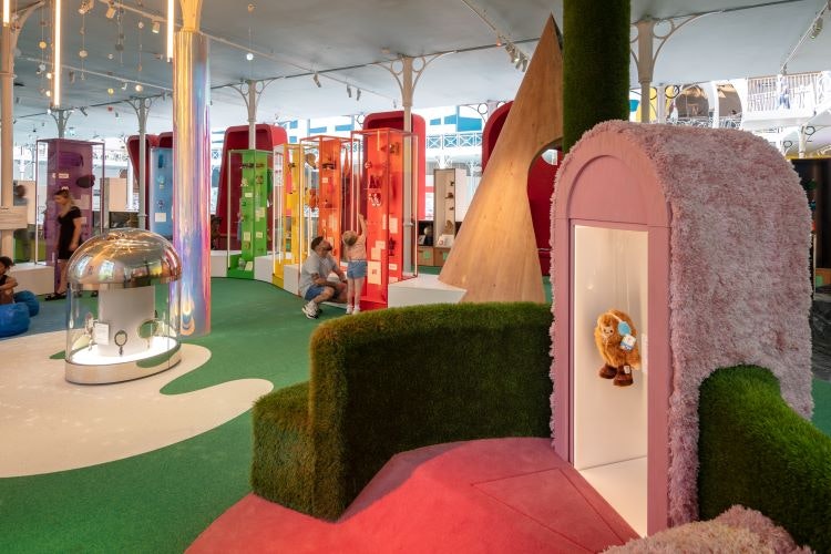
Lambert describes the Imagine Gallery as “a series of room sets” with “different levels of environmental enclosure”. A smaller gallery within Imagine, the Adventure Gallery, features “scenic sky treatments” that intend to make visitors as if they’re outdoors, says Lambert, while the stage area “fits centrally in the gallery with soft, lush thick carpets”.

In the “surreal pink interior” space, display objects begin to “shift in scale” towards more “domestic items”, she adds. Objects that children have collected and made are on display in the This Is Me section, alongside an interactive self-portrait gallery where children can take their picture and trace their face.

Play Gallery
Designed to be more of an “open landscape” with “more sight lines” across the space, the Play Gallery displays objects at a lower level and is defined by arrangements of benches and seating, says Lambert. The entrance to the Mini Museum is a “den-like half cut cone” clad with marble and timber, in line with the Young V&A’s wider focus on materiality, she adds.

The Mini Museum is a sensory space aimed at the 0-4 audience bracket, incorporating various textures, sounds and colours. Build It is a hands-on construction area in the gallery, which also has an arcade at the end with games targeted at visitors aged 10-14.

Design Gallery
Focusing on “big messages around sustainability”, Lambert says the Design Gallery comprises tabletop displays revealing the process behind sustainable, circular objects as well as two structures: The Factory and The Shed. She explains how the forms of these structures “respond to the roof of the original Brompton Boilers building” (referring to the iron-framed building used as temporary display space in the early years of the original V&A Museum), and are made of corrugated sheets of low-carbon hemp fibre panels, with sugar-based resin made entirely from agricultural waste.

Objects displayed within The Factory are grouped by how they were made, from engraving to weaving and printing. The case study tables are made of repurposed timber, from the old cabinetry used by the museum before the redesign. The Shed will house a designer or artist in residence – the first one is designer Clara Chu – while an Open Studio will set design challenges for the young visitors.
There is no suggested linear order for moving through the Young V&A as there are three or four entrance points for each gallery. Lambert says that young visitors can “grow with the galleries” as they have elements for all young people to enjoy.

“Sensory and tactile”
AOC used over 111 materials in the galleries, making it “sensory and tactile”, says Lambert. “We’re not just exhibition designers, we’re thinking about the visitor experience in a different way.”
As well as adding upholstery around windows and incorporating niches in the walls, AOC also added seating clad with different materials throughout the spaces in a bid to improve comfort and tactility.
The large-scale “Amaze Letters”, which present the title of each gallery around the atrium, also explore materiality. Lambert says those for the Play Gallery are made of plastic felt cladding and also contain seating on their reverse side, while the Imagine Gallery letters are “like cookie cutters”, and the Design Gallery letters are “almost balloon-like in their form”.

An added “layer of interactivity” aims to work alongside the object collection to further engage young audiences, according to Lambert. For example, when children turn a wheel next to one of the encased doll houses, a mirror ball and light come on inside “starting a party in the house” while still preserving the object, she says.
“Designing for children is designing for everyone”, says Lambert. Inclusion has been incorporated in “a new and fresh way”, she explains, as designing for children aged 0–14 also means designing for their parents, carers and grandparents.
During the process, AOC found that an average six-year-old’s eye level is on par with a wheelchair user, which Lambert says triggers an “interesting dialogue about how we can cater for all” as we “slowly move away from designing for a six-foot male”.
Learn more about what will be going on inside the Young V&A this summer here.

- Design disciplines in this article
- Industries in this article


