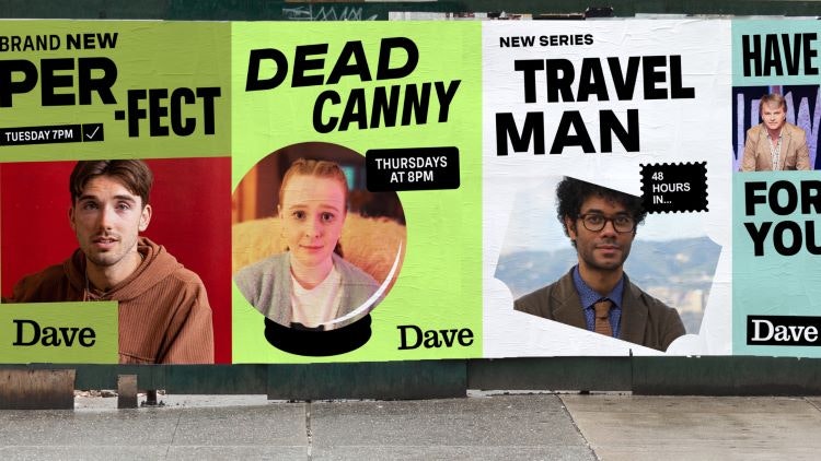
Studio Output has refreshed British entertainment channel Dave’s identity, celebrating the messiness of everyday life with varying fonts and a “misaligned logo”.
UKTV – Dave’s parent company – invited the studio to pitch based on its credentials. According to the initial brief, Dave required “a strong concept system” that UKTV’s internal team can evolve in the coming years, so the studio provided “a clear north star to follow” for the visual identity, says Studio Output partner and creative director Johanna Drewe.

Apart from its existing hero logotype, Drewe says that everything about Dave has changed, centring around the channel’s ethos that “humour is a damn good antidote to the awkward mess that is modern life”.
To translate this concept into “a tangible visual system”, Studio Output opted for a mix of fonts that are “a bit wonky” and show “frailty and flaws” using a variable weight typeface called Spezia, Drewe explains. Being able to “dial it up and down”, matching different weights with different tones, allowed the studio to “create a dialogue with emphasis and expression across everything Dave says”, she adds.
The combination of styles makes for a “very human” feel that opposes “slick, conventional TV branding”, according to Drewe.
Though the Dave logotype remains, as it was “crucial to recognition of the brand”, Drewe says the wordmark now carries “a sense of imperfection”, now sitting in “a slightly off-centred lozenge”. She describes the most challenging aspect of the design process as “creating what looks like a messy, unstructured system in a way that can be replicated and built upon for years to come”.
As with the design system, Dave’s new suite of motion graphics seeks to “prod, poke and subvert the world around us” through “logo stings and trails”, according to Drewe. It seeks to make something funny from “every-day relatable moments”, such as a toaster popping, an alarm clock going off and receiving a text message.
Studio Output switched out Dave’s previous black and white “one note” colour palette for one more reflective of the channel’s new content, says Drewe. While black and white are still “central pillars”, the secondary hues are inspired by “the world around us” without being to bright or vibrant, she adds.

Idents have appeared on TV with more planned over the summer to introduce wider assets across social media and events.

- Design disciplines in this article
- Industries in this article


