How&How has partnered with Flyp – a platform for buyers, sellers and estate agents – on a new design system to help the company in its bid to turn the housing market on its head.
Flyp works by analysing the current and potential value of a house and helping to implement the changes required to achieve that valuation. For example, if renovation is needed to get the best price, Flyp will manage and finance the work without requesting upfront payments, before sharing the property with its network of estate agents.
This results “in a sale over asking price”, according to How&How founder and creative director Cat How. As well as this, How adds that Flyp guarantees agents “high quality properties, in exchange for non-exclusivity”, meaning they must compete to make the sale, “which is ultimately better for the seller”.
How explains that the “visual” name of the company was a “gift”, and immediately made the studio think of how it could “flip, rotate and mess with the design system”. Flyp’s upside-down house logo was born from this idea and is designed to embody the “anarchic spirit” of the company’s offer.
“We wanted it to be simple and bold”, says How, adding that the upside-down house also appears as “a location pin or a label” which shows the “analysis points of the house check”. Flyp’s new strategic positioning follows the same disruptive pattern as the identity, however, How says it is meant to convey “a playful call-to-arms to upend the status quo”, rather than an “aggressive” tactic.
As the real estate market is often assumed to be dishonest, the studio set out to build a “positive” brand with “personable irreverent messaging”, How says. Flyp’s new positioning was designed to “shine a light on the deep flaws in the system, rather than wallpaper over the cracks”, she adds, explaining that honesty was “baked into the brand”.
The colour palette seeks to “evoke the warm, positive and irreverent nature of the brand character”, according to How. Bright colours like the “brick” orange, “tile” pink and “lawn” green were chosen to move “as far from traditional real estate” as possible, says How.

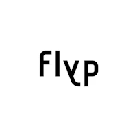
Flyp has a new bespoke wordmark by How&How and an off-the-shelf primary typeface called Deia from type foundry Typeverything.
How&How also translated the brand system into a “fully accessible digital design system”, taking a “user-first approach”, says How. For Flyp’s three core audiences– regular sellers, sellers who are struggling to make a sale, and estate agents – How says the studio designed a website that gets “each persona into the right flow quickly”.

As Flyp is a new concept the website also needed to “explain what Flyp is and how it works” How explains. “We use step by step explainers to do this as well as 3D graphics to show how the house check and fix up works”, she adds.
Flyp’s new website is now up and running and the identity has been rolled out across social and marketing channels. How&How is currently working on the user portal that will give Flyp customers the chance to follow the “progress of their sale in a dashboard experience”, says How.

- Design disciplines in this article
- Industries in this article
- Brands in this article


