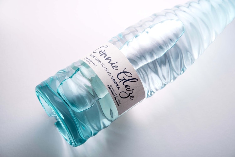
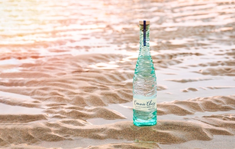
Exeter-based studio Buddy Creative has developed the branding and packaging for Connie Glaze Vodka, including a bespoke bottle that resembles the “smooth undulating patterns in the sand” left by the outward tide.
The studio has worked with makers of the vodka Southwestern Distillery since 2017 when it developed a bespoke bottle and refreshed branding for its flagship brand Tarquin’s Gin. In 2020, the distillery called on Buddy Creative again to create the branding and packaging for a new-to-market craft rum brand Twin Fin.

For both these brands, Buddy Creative has continued to work with the Southwestern Distillery team “on rolling out further packaging and core brand applications”, according to the studio’s creative partner Mark Girvan. Connie Glaze is a new brand with a name devised by the distillery team which is inspired by local beach Constantine Bay.
A slow sand filtration method is used to purify the vodka before it is blended with distilled water, a process that Buddy Creative took cues from in its designs. Connie Glaze’s bottle was designed with the idea of “a genuine natural coastal connection” in mind, says Girvan, as it takes cues from the “beautiful smooth undulating patterns in the sand” that are left when the tide goes out.

Recommended: Bruichladdich cuts carbon with new whisky bottle design by Thirst
One of the challenges with a project like this is “taking it from a pencil sketch to the finished article without diluting or compromising the original idea”, he explains. Girvan describes how “each ripple, was uniquely formed and shaped to flow with the other ripples across the bottle”, just as it would on a beach. He adds that the blue Ombre effect is sprayed onto the glass “to further enhance the brand’s coastal connection”.
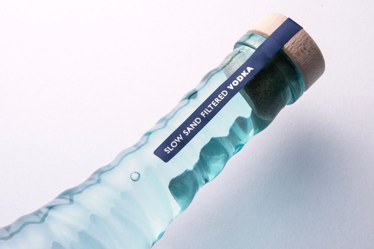
The bottle is made from 100% recyclable glass with FSC labels and natural wooden corks.

Recommended: A gin released for Scottish Opera’s 60th anniversary mixes musicology and mixology
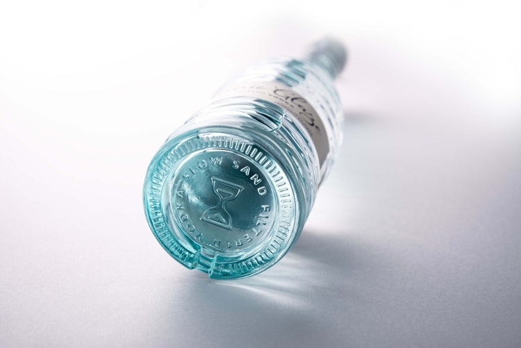
An hourglass symbol is embossed on the base of the bottles to symbolise the slow sand filtered story and serves as “an additional brand message and touch point”, says Girvan. For the on-trade – which refers to places that sell beverages for immediate consumption on the premises like bars, restaurants, and pubs – Buddy Creative developed some additional Connie Glaze icons.
These icons communicate how 1% of sales are donated to cleaning Cornish Beaches and that the wheat used in the vodka is 100% British and will appear on “other brand communications where appropriate”, according to Girvan.

Buddy Creative also devised a refillable packaging system for on-trade use, comprising a five-litre bag in box, so that bar tenders in bars, pubs and restaurants can top up their bottle multiple times, reusing a single bottle.
Connie Glaze’s paper label was chosen for its “natural sand-like qualities” and has “a yellowish uncoated matt paper” made from 5% apple waste from apple juice production and 95% FSC certified paper pulp, Girvan explains. He adds that the lettering for the logotype was created to be “reflective of the artisanal organic credentials of the brand”.

- Design disciplines in this article
- Industries in this article
- Brands in this article


