Derek&Eric has rebranded high-end craft beer brand Really Good Beer Society, with a roundel logo that urges consumers to read into the charitable causes supported by each beer.
Really Good Beer Society was founded in 2021 and only uses small, independently owned brewery partners that are focused on sustainable production. It operates by seeking out projects that it feels are solving some of the planet’s biggest problems, pairing each cause with a beer and donating 2.5% of profits made to charity.

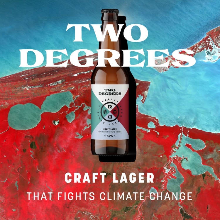
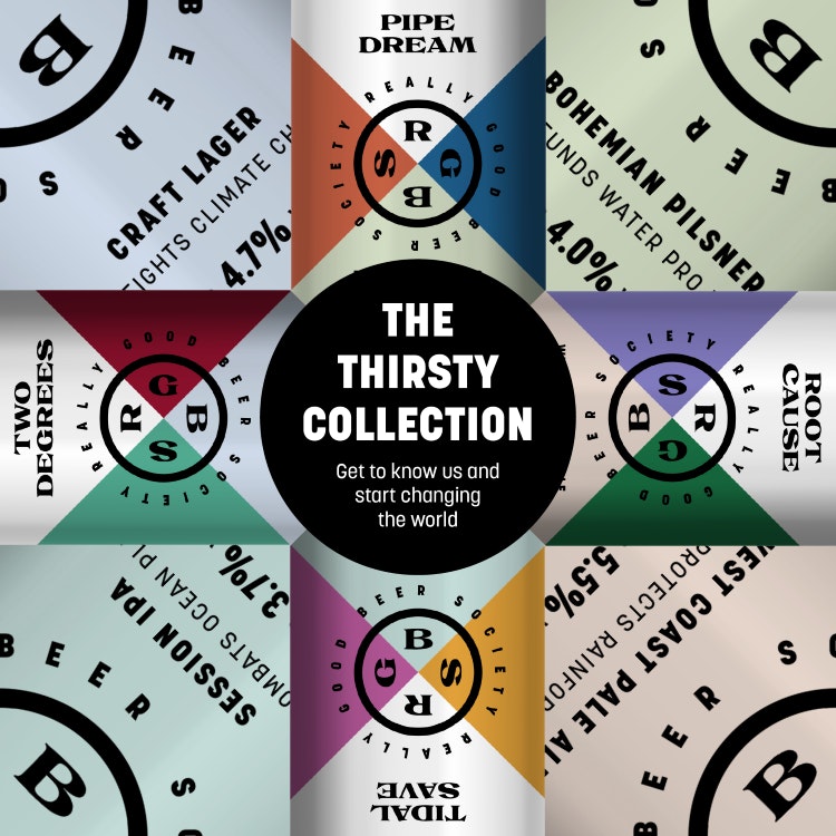
The name of each brew is chosen to represent the beer, cause, and charity partner. These include Two Degrees craft lager, which supports climate change initiatives through Soil Association UK; Root Cause West Coast pale ale, which tackles deforestation through Rainforest Trust UK; and a variant that aims to help clean the oceans called Tidal Save Session IPA.
Derek&Eric was initially brought in as a consultant to support the brand, and that work then led to it taking on the rebrand project. The aim was to make the brand stand out in a competitive market while evolving it to be more than “just another craft beer”, according to the studio’s creative founder Adam Swan.
With this in mind, Swan says Derek&Eric sought to develop a brand voice that is “not preachy” but spotlights some causes “that need a bit more attention”.
The roundel logo split into quarter segments “forces you to engage and read around it, and draws you in with intrigue”, Swan explains. He adds that the studio also opted to foreground the beer name in the label hierarchy to help distinguish different brews in the range.

As well as retaining the “pure and premium” white from the previous identity, Swan notes that Derek&Eric introduced a “harlequin colour palette”, bringing in “some much need vibrancy”. The hues for each beer also correlate with the cause and name attached to each brew.
He describes the craft beer category as “a world of no rules where anarchy rules”. Since Really Good Beer Society is intended as a beverage for hotels and high-end bars, the brand is aimed to appeal to “a premium discerning consumer”, says Swan. “In a world of visual chaos, we felt something with purpose and poise would be a tonic,” he adds.

For its headline font, Really Good Beer Company now uses BN Pepper from Brandon Nickerson Studio, a bold serif typeface inspired by vintage French type. Swan believes that it suits the target environment of upscale bars and hotels as it “exudes quality and human craft”, while its extended and slightly unusual serifs “have a playful, kinetic quality”.
Further beers with new charitable partnerships will be added to the range in future as the brand grows. As such, it was crucial to create a design system with longevity “to ensure [the studio] didn’t design the brand into a corner”, Swan adds.

- Design disciplines in this article
- Industries in this article
- Brands in this article


