Tomorrow (16 June), EE will unveil its new interactive Studio store in Westfield London, offering an enhanced retail experience that aims to make visitors feel more comfortable with technology.
The concept was designed by the brand innovation studio Dalziel and Pow in collaboration with Your Studio and working closely with EE’s internal team.
Since high streets took a hit in the wake of the pandemic, brands have been questioning how they can stay relevant and attract shoppers, according to BT/EE managing director of commercial Bridget Lea. This paired with EE’s reinvention as BT Group’s flagship consumer brand led to a new strategy that seeks to reinvent the role of retail in the telco industry.
BT Group Consumer Division CEO Marc Allera says it involves prioritising the customer and helping them to navigate “the complex world of networks, devices, technology, platforms and services”. He describes the EE Studio space as a “great manifestation of how the role of retail can evolve” to keep customers returning in person.
The space was designed to be “the antithesis of the traditional mobile phone store”, says Lea.
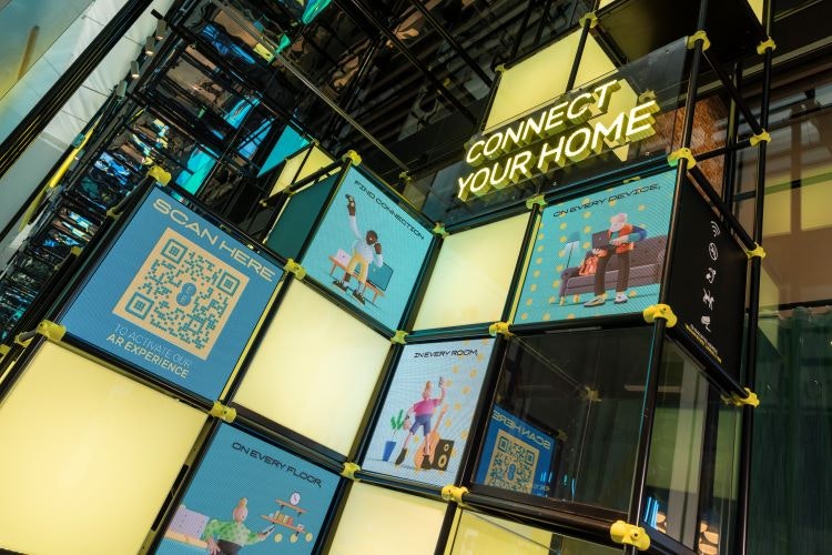
The double-height, 3D shopfront has no door in order to draw people into the space from the off. A QR code on the shopfront leads to an AR experience to further encourage people to head inside.
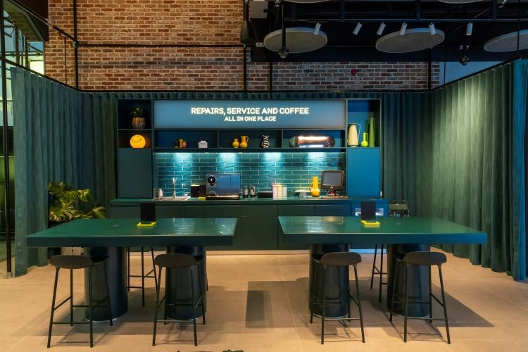
Visitors will then be greeted by Welcome Zone and Base Camp areas: a changeable digital window canvas to display product launches and in-store events, and a social area where customers can sit on sofas, chairs and work benches with a tea or coffee. Dalziel & Pow creative director David Dalziel says that the hospitality zone is an “unexpected” element, designed to be “generous, open and welcoming” to show that EE is “giving something more”.
Next, visitors will come to the Digital Spa designed by Your Studio to promote digital wellbeing by showing customers how they can use technology in a positive way, with Apple Watch fitness tracking or AR yoga sessions. It also features guided meditations via noise cancelling headphones and a low-lit sensory room lined with screens that show nature.
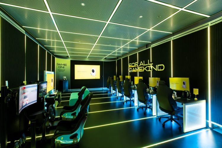
The Gaming Zone is filled with professional gaming rigs, racing simulators, virtual reality experiences and games and consoles, so gamers of all levels can try new technology.
Other areas of the EE Studio include the connected home area, which mimics a home with tech placed unobtrusively in the space, The Stage area for events, pop-ups and interactive programming, and Tech Live, an interactive bench allowing customers to trial new devices and speak to experts.
Dalziel explains how the 390 square metre space was “big enough to make compartments of interest” through “self-contained stories and pods”, adding that it is “more like an exhibition than a shop”. The EE Studio’s layout is modular so that parts can be altered or completely changed if required.
“The most expensive thing in retail is change”, says Dalziel, which is why the modular design will also save EE time and money when it comes to switching up the interactive elements of the store.
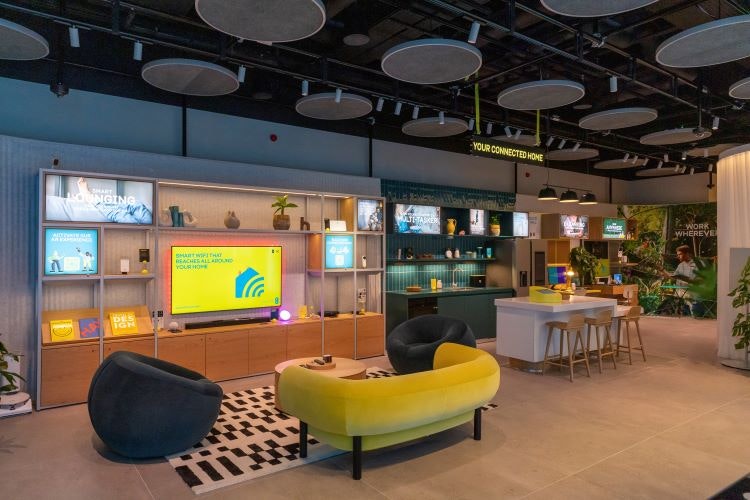
The ceiling is lined with scaffolding with features such as lights and panels suspended from it, which Dalziel says provides “a temporary feel in a good way”, describing the EE Studio as a “responsive” retail space that can “be anything it wants to be in five years’ time”.
EE and Dalziel & Pow worked with the Able2 network – BT’s network for disabled employees – from the beginning, ensuring that the whole space is compliant with the Disability Discrimination Act 1999. Lea says that this was easier for the open areas but took more “thought, care and consideration” for the hub spaces.
Speaking on the aesthetic, Lea says: “Whenever any tech company has tried to reinvent their look, they’ve looked to Apple and done a version of that”. On the contrary, she adds that EE opted for “a vibrant expression of a brand with no compromises”.
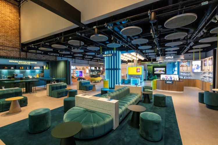
EE’s corporate colour – teal – is “very popular in home interiors”, making the space look “on trend”, says Dalziel. Acoustic seating booths, bubble-like lighting, and “soft edges on every corner” seek to integrate EE’s double circle logo into the space, forming “a partnership between the graphic and 3D identity”, he adds.
The outline of the logo also appears in the large-scale yellow neon lighting in the store entrance, and cylindrical yellow interaction points dotted throughout.
Dalziel says that ideas from this store “will trickle down” into the other EE Studio stores set to open this year, including Cardiff, Manchester Trafford Centre and Bluewater in Kent. Allera stresses that the EE Studio is “not the final destination” of the brand, but “a glimpse into the world of new EE”.

- Design disciplines in this article
- Industries in this article


