Brew92, by Liqui Group

Liqui Group has tapped into the Japandi trend – a blend of Scandinavian and Japanese visuals – for its design of Brew92’s flagship space in Saudi Arabia. Home to a café and roastery, the store is situated within an angular building – a mix of Brutalist-inspired architecture and concrete and glass. In honour of its surroundings, Brew92 is decked out with concrete columns which aim to “add a sense of structural grandeur to the interior”. Liqui has also used plenty of oak for the interiors – on screen walls, window shutters, and as dividers throughout the space. These are not only decorative, they also help to provide protection from the sun’s glare (thereby cutting down on the need for air conditioning), the design team explains.
Stüssy Paris, by Willo Perron

Willo Perron – the designer behind the sets for Rihanna’s Savage x Fenty sets – has collaborated once more with streetwear fashion brand Stüssy on its Paris-based store. Opening in the Marais district, the new space incorporates a mix of materials – from sheet metal to wood and glass. Its goal? To bring “a Southern California point of view to the City of Light”, says Perron. The minimalist space is broken up with huge perforated metal pillars and lilac colour notes. It will house a number of exclusive Stüssy products, with ample shelves for a lot of sneakers. “With each chapter I try to have something consistent and recognizable while introducing new items and materials, tailoring it for the city and the space,” Perron says of the store. Oak cabinetry from previous stores has been reused, which aim to provide a contrast with the stainless steel counters.
The Alice Hawthorn, by De Matos Ryan

The Alice Hawthorn is the last remaining pub in the village of Nun Monkton, North Yorkshire. Over the past decades, the destination has suffered from socio-economic changes and even closed for a period of time. The brief for De Matos Ryan was to broaden the Alice Hawthorn’s use, with a suite of guest bedrooms. The new space had to provide tourists and the local community with a “high-quality but affordable basecamp” to explore the local surroundings, explains De Matos Ryan director Angus Morrogh-Ryan. The rethought space clusters timber frame buildings, brick outbuildings and Douglas firs around a newly-created courtyard – a “notional extension of the village green.” According to the design team, sustainability was at the forefront of the project. A ground source heat pump assists with heating and hot water, while low energy lighting is used throughout.
Entrée, by Holloway Li

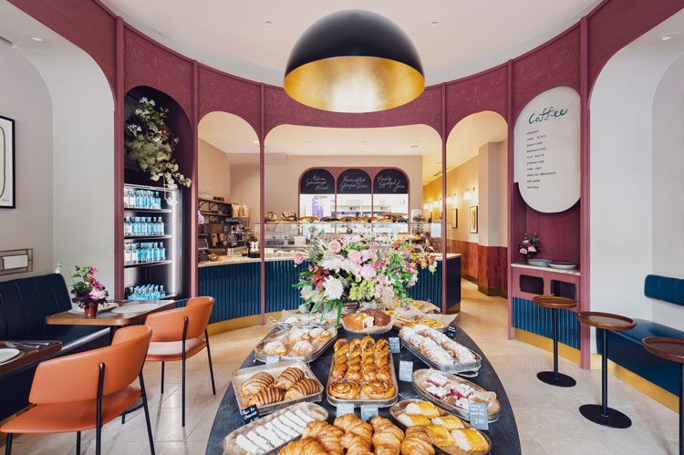
Interiors duo Holloway Li turned to the ever-influential film director Wes Anderson as inspiration for a new café in Londons’ Notting Hill. Entrée is a Tbilisi artisan bakery, making the link to Anderson’s The Grand Budapest Hotel – where a chocolate-making sweet shop is a central location – an irresistible reference point. Obvious Anderson-esque touchpoints are the pink tones, though the film is more subtly evoked through the window arches where you can watch the pastries being baked. These hope to “conjure the childlike wonder of peering into a sweet shop”, according to the designers. A central point of the space is the “supra” – a Georgian serving table which is the central point of a feast, and in this case, the café itself.
AB Games, by Bolshakova Interiors

“We wanted to break the stereotype of a teenage style office design in the gaming industry and show how a creative spirit can reside in a sophisticated grown-up design,” says Nataly Bolshakov, about the headquarters for AB Games in Kyiv. Bolshakov’s eponymous design studio recently designed the new studio for the mobile game developers, playing on the world of video games. The space, which is almost 3,000 square metres, had to house work areas, meeting places, and soical hang-outs. Throughout, there are playful touches, such as a brightly-coloured wall niche where you can move cubes around (it’s inspired by one of the studio’s game). An LED-backlit corridor serves as a “portal” between the work spaces and common areas.
DimArt Studio, by In&More

Berlin-based studio had a very specific challenge when it came to designing the space for beauty salon DimArt Studio, also based in the German capital. None of the colours used could cause light distortion for any of the clients’ hair colouring processes. For the relatively small space, the design team went for deep blues and pinks and some on-trend graphic details – such as arch decorations on the wall. The arch motif is repeated throughout the interior – on mirrors and shelving units which display hair products.

- Design disciplines in this article
- Industries in this article
- Brands in this article


