Every design project benefits from having a clear understanding of the target audience. But that’s complicated when the target audience involves very different groups of people, and has to cover both B2B and B2C use cases.
That was the challenge for Thisaway when creating a new identity for the company formerly known as The Little Foxes Club. It’s one of the UK’s biggest providers of children’s play programmes, from football coaching to holiday camps.
After growing quickly, the brand had separated around two of its main offerings – The Little Foxes Club for the core classes, camps and parties, and Foxes FC for their football academy.“From a customer’s perspective, this brand architecture proved confusing,” Thisaway’s design director Adam Cale explains.
“With two different websites and identities that talked to very different audiences and age groups, it wasn’t clear these two offerings were part of the same brand. The crux of the brief was to unify the brand, bringing all of their offers together under one cohesive identity.”
The Bath-based studio needed to appeal to the kids that take part in the sessions, who range from toddlers to teenagers, as well as their parents, and the organisations, like schools and local councils, that buy in the services.
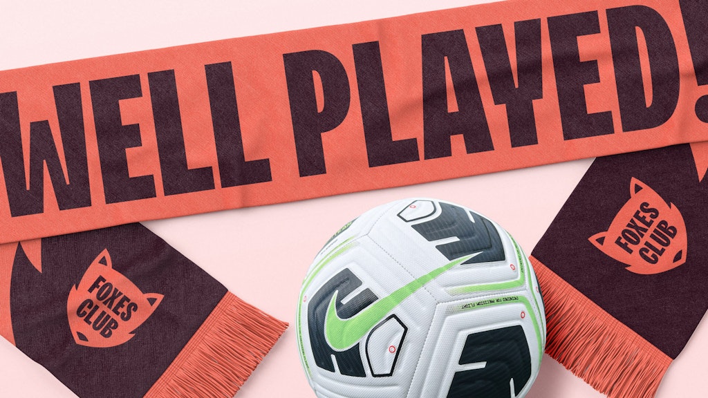
Thisaway’s team honed in on the idea of “Well Played” – that play is vital for every child’s development, helping them build new skills and boost physical and mental well-being.
“It also acts as a promise to parents and B2B audiences, whilst serving as a familiar term of encouragement for the younger audiences,” Cale explains.
Key decisions
Changing the name and repositioning Foxes FC
The Little Foxes name was seen as “slightly prohibitive and patronising,” Cale says and didn’t resonate with the teenagers who attend the sessions. It also jarred with a big company that has ambitious plans for future growth.
“Dropping the ‘Little’ helped us widen the appeal of the brand and better suited their status as market leaders,” Cale says. The team also repositioned Foxes FC to become the name of the academy team, rather than a separate brand.
Centering the identity around an iconic badge
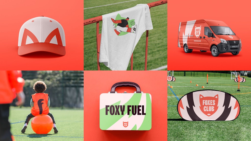
The Foxes Club produces a lot of kit and needs to be obviously visible in spaces like parks and school fields that they don’t own. So the pressure was on to find the right logo.
“We tried a lot of things with the identity, ranging from mascots to word-marks to stickers,” Cale says. “Nothing was providing the seamless flexibility that we wanted.”
In the end, it was a crest that made the most sense. “It felt more age agnostic than anything we’d looked at previously and formed the basis for a simple, bold identity that can be effortlessly tailored to different audiences with simple changes to imagery and tone of voice.”
Tailoring different brand expressions to specific audiences
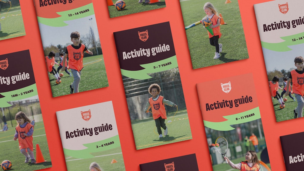
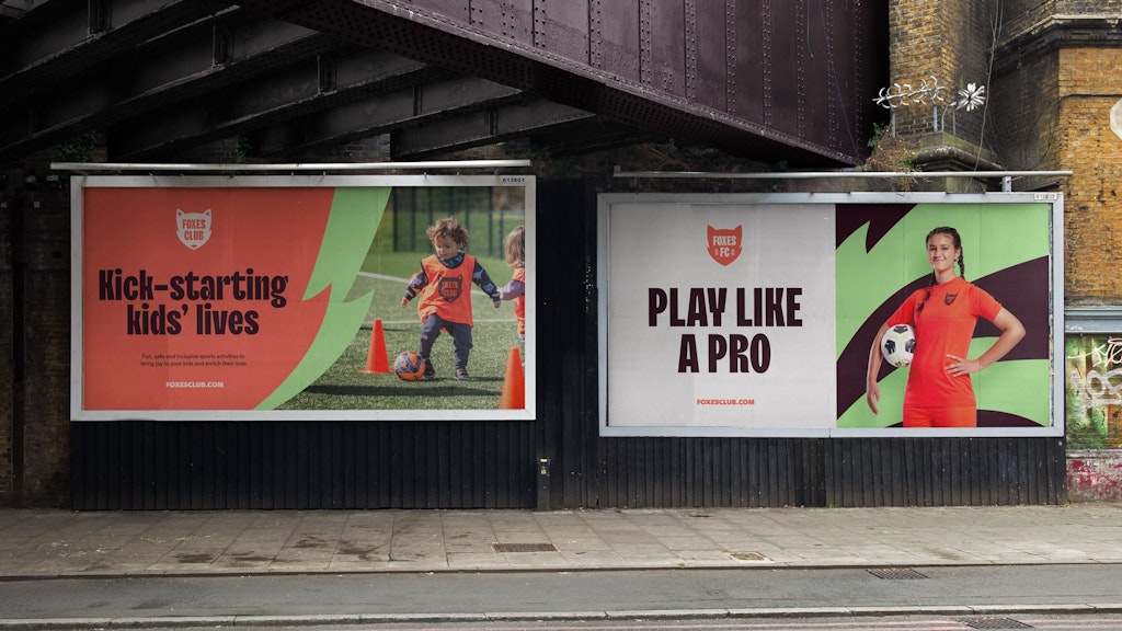
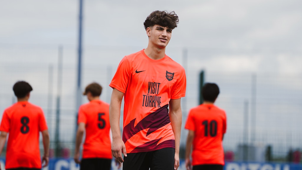
For the older children, they use the darker colours from the brand palette, such as the “paw brown”, the photography is more posed and aspirational, and the text (TT Trailers Black for headlines, Gibson for body copy) is all in uppercase.
For the younger children, they use lighter colours and display the text in sentence case, to make the comms warmer and more friendly.
- Design disciplines in this article
- Industries in this article
- Brands in this article
- Tags in this article


