Brighton-based studio Evoke has rolled out a new brand for 140-year-old publishing house, Pan Macmillan.
The team wanted to better reflect the breadth and diversity of Pan Macmillan’s output, which ranges from The Gruffalo, by Julia Donaldson and Axel Scheffler, to Douglas Adams’ The Hitchhiker’s Guide to the Galaxy. Dating back to 1843, the company is one of the UK’s big four publishers (alongside Penguin Random House, Hachette and HarperCollins).
“I think historically the book publishing world hasn’t paid too much attention to their brands, but as they work harder to reach out to audiences, I think that’s changing” says Evoke’s founder and creative director, Tom Leach.
“We wanted to bring the publisher and their books closer together. That helps people – including potential new authors and illustrators – understand what they offer.”
Taking the established double M logo as his starting point, Leach had to balance staying close enough to the brand’s visual heritage, while pushing it far enough to create a new sense of excitement.

It helped that he’d previously worked with Pan Macmillan’s corporate communications director, Lois Bray. She commissioned him to rebrand Bonnier Books in 2022.
“Quite often, I think clients are pleasantly surprised when you push them a bit further,” Leach explains. “They can be afraid to ask for it, because they might be worried that you will go a bit too far, but we had that trust.”
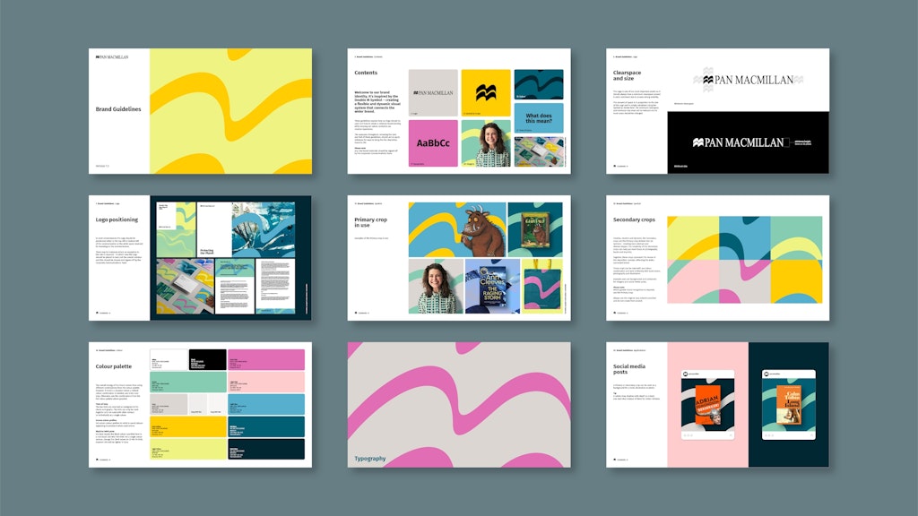
Alongside the new concept, Evoke produced a wide range of new assets and a set of “flexible and adaptable” guidelines to help the in-house teams use the new brand in consistent and creative ways.
Key decisions
Building on the heritage of the brand
“For us, freeing the brand meant making it more expressive and joyful to work with, giving those iconic double M’s centre stage,” Leach says.
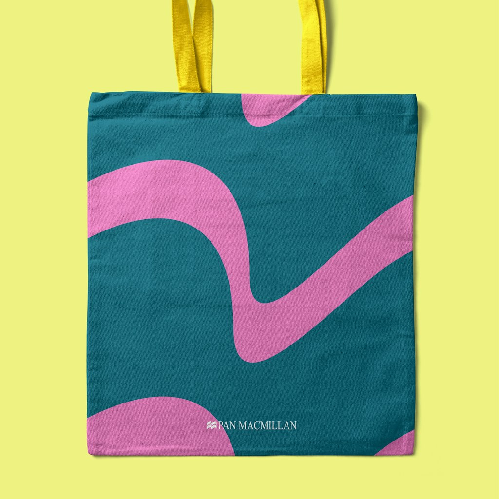
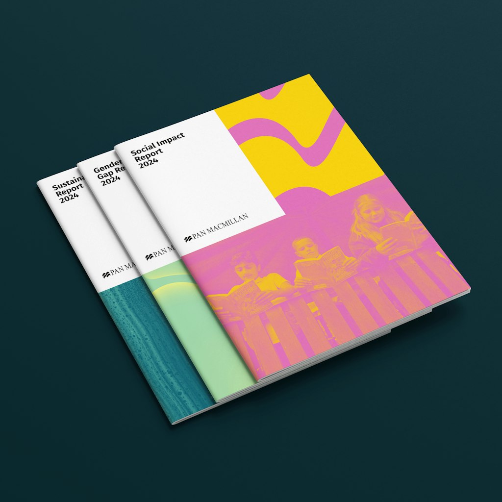
The solution was a large crop of the original logo which can be used with different combinations of the new, more vibrant, brand colours, as well as photography and other imagery.
“We wanted to make the brand more confident and immersive, to bring it to life with visual elements that make it more recognisable and memorable,” he says.

Breaking the design down to create a flexible toolkit
The new brand had to be adaptable and scalable, to work on everything from stationery to big events. Evoke divided the new large crop into six further elements, “creating a tapestry of shapes and colours that can be used creatively across the brand toolkit,” Leach says.
This is designed to help Pan Macmillan’s team apply the new look in interesting ways, and remove the need for stock photography.
“We wanted to create the ability to add depth and texture, for example by using abstract imagery to connect with headlines and help to tell stories,” Leach says.

Bringing the brand and the books they publish together
“With such a big brand and such rich content – the jacket designs, authors and illustrators – we wanted to bring these elements closer, immersing both the brand and the books they publish together,” Leach says.
In that way, he says, you get the best of both worlds, raising the profile of Pan Macmillan “in conjunction with” their titles.
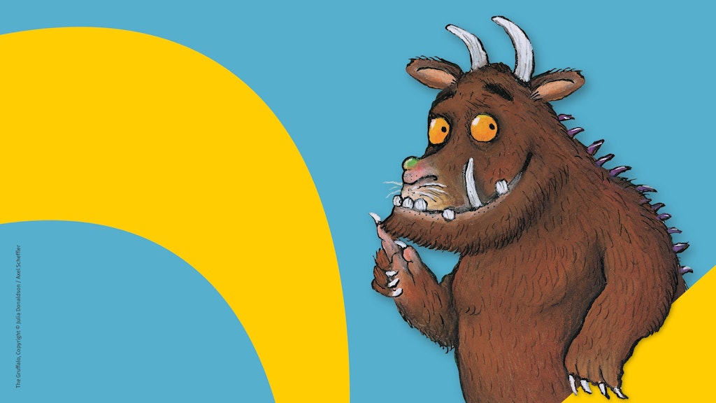
Imagery like author portraits, pictures of characters, or book covers can be used with a wide range of backdrops of the brand imagery, blended together or used as cut-outs to create “a visually interesting and immersive feel.”


- Design disciplines in this article
- Industries in this article
- Brands in this article


2 responses to “Evoke creates a new brand for Pan Macmillan”
Evoke’s rebrand for Pan Macmillan is amazing! I love how they’ve made the brand more playful while keeping its heritage. The vibrant colors and flexible design make it stand out, and it’s great to see the brand and books brought closer together. It feels fresh and exciting!
I love the new identity! Would also love to visualize the evolution of the brand (on this and future case studies). Cheers!