Design Week has a redesigned identity and website, as part of its relaunch under new ownership.
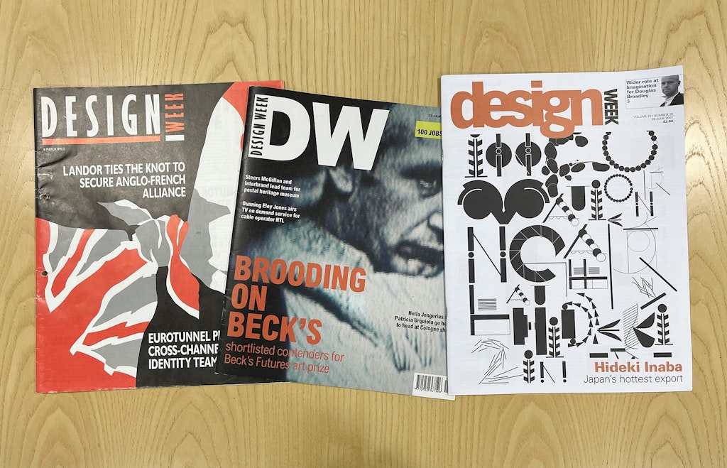
DW’s publisher David Coveney and Standfirst’s design and project lead Chris McInerney pored over the magazine’s archives, dating back to its launch in 1986.
“The most important thing was taking the DNA of the old branding, and accepting we’re in a new place,” says Coveney. “We wanted a connection with the past, but to inject a bit of swagger, and be more confident.”

Early on in the process, Coveney and McInerney considered a name change, “but not terribly deeply”, Coveney says.
“Rebranding is fraught with danger and has to be backed up with some real thought. In today’s world there has been a strong shift towards people cultivating their own feed by subscribing to newsletters.
“Our weekly newsletter will be an important channel in its own right, landing in people’s in-boxes every Thursday. So Design Week still fits perfectly, even in the digital era.”
While keeping the name, Coveney also says they were tempted not to change the identity either, “but we realised it all had to work with a redesigned website.”
As a reference point, McInerney went back to the original style created by DW’s late art director Bob Batemen. “I didn’t want to reinvent the wheel but to build on what had gone before,” he says.

Over the years, the DW logo had been through several redesigns, the last iteration being lower case with ‘week’ written vertically and in smaller letters. “I wanted to give each word equal prominence, because it’s known by its full name, and to make it as loud and proud as possible,” McInerney explains. “I also wanted a clean simple word mark that would be easy to replicate across different platforms.”
The new off-black identity is upper case, which “leans slightly into what has gone before, and is a nod to the Bauhaus aesthetic,” he adds.
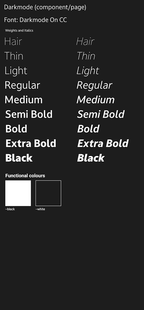
He chose a typeface from Dalton Maag, in part because the foundry was founded in the UK and DW aims to champion the UK design industry. Darkmode is a humanist sans typeface designed for modern user interfaces. “I’ve tightened up all the kerning and leading,” he says of the new logo.
On the website’s home page, the very top of the logo is cropped, “a nod to the old traditional printing methods”, says McInerney, “and it adds some personality.”
Darkmode is also used throughout the website. “It’s often tempting to use two fonts, but we felt it wasn’t necessary here,” says Coveney.
“It’s about paring things back – we spent a lot of time thinking about what we can take away. The words are there to support the work that other people have done.” He likens the new site to a minimalist art gallery, where the work of designers will be able to shine.
McInerney echoes this. “With a design website, you don’t want to overdesign it, you want it to be invisible as a frame, to see the content.”
The Bauhaus influence continues on the website, such as the use of bold horizontal and vertical lines.
Coveney insisted that images will be presented in their original aspect ratio. “It annoys me when a photo gets cropped. Images need to be presented with care, because a lot of work goes into them.” Though he admits that “creating a design that works with every shape and size (of image) adds complexity.”
The original DW had stark black and white photography with colours laid over the top. As a nod to this, McInerney has used colours on the website randomly, as a subtle way of keeping the site lively. “I’ve taken from primary Bauhaus colours red, yellow and blue, freshened them and added green as an accent colour.”
McInerney has also created a circular lettermark. The roundel appears on all internal web pages, as a complementary icon to the main wordmark. “We can have some fun with it, playing with animation and colour,” he says. “It adds personality to the brand.” It’s also used on all social media channels.
Designing for such a well-informed audience is not without its pressures, McInerney admits. “It was slightly daunting to start with!” he says. “I tried not to overthink it because you won’t please everyone.”
And to that end, we welcome readers’ feedback…

- Design disciplines in this article
- Industries in this article
- Brands in this article


3 responses to “How we designed the new Design Week”
Happy to see that you’re back!
The kerning of the new logo could use a bit of a tweak (IMHO)
All the best with the relaunch!
Great to see Design Week back with news and views on the British design scene. It’s been missed in the rush to save costs on print publishing. Congratulations on coming back – will this be a digital or print magazine or both and how do we subscribe. We are a design agency turned publisher of children’s and adult books.
Really great to see Design Week back. Interestingly back in the 80’s the publisher Anthony Nares, founder of Marketing Week, offered me the job as Editor of Design Week! Instead I went on to start up my own design consultancy. Unfortunately Anthony died in a skiing accident at the height of his career. . . He really was such an ebullient and dynamic character. Exciting times in the design world back then. Good luck with your new venture.