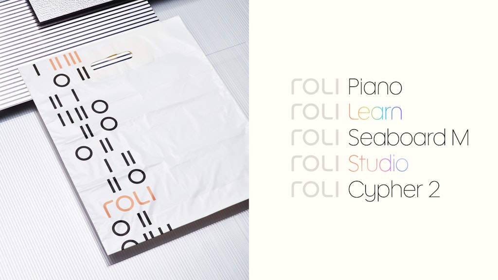
Few brands benefit from being split into smaller parts. The London-based music tech company ROLI had two distinct entities – the main eponymous brand, aimed at professional musicians, and Lumi, for beginners looking to learn a new instrument.
The two parts of the company operated too separately, and marketing budgets were spread between them, which compromised either’s ability to make an impact with its messaging.
This fragmentation was a problem – “The ROLI brand had lost its power,” DixonBaxi senior designer Jas Walsh explains. With an ambitious goal of empowering one billion people with its products, ROLI needed a new way to share its story with the world.
The DixonBaxi team spent six months working closely with founder and CEO Roland Lamb to unify and reposition the brand, making it warmer and more accessible.
The challenge was to create an identity that would appeal to an audience that ranges from Grammy-winning artists to total novices. The unlock was to focus less on the products themselves, and more on the creative joys of making music.
Building around the core idea of “free the music,” DixonBaxi developed a new brand system, logo, website, tone of voice and motion toolkit, which took its cues from the five dimensions of touch that musicians use on different instruments – strike, press, glide, slide, lift.
Key decisions
Uniting a diverse product family
By bringing together the disparate and sometimes siloed ROLI and Lumi parts of the business, DixonBaxi created a single brand with a consistent naming and identity system. “The new system brings cohesion where there was once fragmentation, creating a more sophisticated and unified product experience,” Walsh says.

Creating a logo that didn’t feel tech-driven
The new ROLI symbol is inspired by five piano keys and is designed to reconnect ROLI with its musical mission, moving away from its previous product-focused approach.
“We’ve created a brand that feels poetic, elegant, and premium – not like typical tech,” Walsh says. “Above all, it’s accessible, which was crucial to the project’s success.”


A colour scheme grounded in music theory
The circle of fifths is a diagram widely used in music theory to demonstrate the relationship between different keys. DixonBaxi created a new colour system for ROLI inspired by this concept, with different colour schemes being used to engage different audiences.
“This adaptive palette mirrors the way musical chords combine to create harmony,” Walsh says. “Darker, more vivid tones appeal to professional creators, while lighter, playful colours invite learners.”

- Design disciplines in this article
- Brands in this article


