Whatever the faults of its service, the old British Rail was almost endearing in its marketing. ‘We’re getting there,’ InterCity posters used to say humbly, as if the national transport infrastructure were permanently stuck between stations marked ‘incremental improvement’ and ‘managed decline’.
Today, however, with Margaret Thatcher’s ‘great car economy’ finally gridlocked, ‘integrated public transport’ is a political priority. Nearly a third of people ‘spontaneously identify’ a transport-related issue as the main problem facing Britain, according to the Government-sponsored Commission for Integrated Transport. Network Rail reckons it needs £54bn over the next ten years to get it right.
Quite an uphill struggle then. But this week the design industry put its shoulder to the wheel. The likes of Tim Fendley, Wally Olins, Chris Ludlow and Rasshied Din scratched heads with transport heavyweights including CfIT chair David Begg at a conference in London. Their aim? To place information design at the heart of the solution.
In a parallel move, the Design Council launched its ‘blueprint’ for how design can benefit the transport system. Meanwhile, Citigate Lloyd Northover was asked to boost uptake of bus and rail services by West Midlands hub Centro (DW 3 July).
But what role can design and branding really play in improving public transport offerings in Britain?
Conrad Jones, Centro head of communications, is adamant that ‘branding will help to make the public system more coherent, accessible and attractive to passengers’, leading to a ‘significant increase’ in patronage.
Centro research found that diverse branding by operators and infrastructure providers creates a ‘fragmented image’, which leaves the public confused. Without a common standard for printed information, maps or signs, people often rely on local knowledge to get around.
A common brand will signal integration and accountability, Jones maintains. ‘Identifying a network in people’s minds’ is the focus of CLN’s brief, he says, but a fully branded system ‘brings greater expectations’.
Careful not to promise what it can’t deliver, Centro has opted for a partially branded implementation, with the aim of complete integration as part of its 20-year vision. ‘But we’re under no illusions that the difficult part starts now,’ Jones adds.
If revamping infrastructure is for the long haul, AIG London partner Tim Fendley, a convenor of the International Institute of Information Design conference, believes wayfinding has much to offer in the interim.
‘Everything we’re hearing from the Government is that things aren’t going to change for ten years. In fact, it’s going to get worse – you have to dig up the road to make it wider. What we’re saying, though, is you can improve the way we do information.’
Fendley continues, ‘Integrated transport is a wonderful idea, but how do you navigate round the system? Every journey jumps from one mode of transport to another – whether it’s walking to bus or bus to train. What stops people making more journeys by public transport is that they don’t trust the system, because they’re not getting [sufficient] information. Maybe there are blockages, cancellations and reduced services, but the more we know about it [as passengers] the more relaxed we are.’
Although rail managers ‘probably do believe’ in customer service, ‘the system infrastructure is so bad that there are nine defeats for every win – and that saps confidence and belief,’ says Interbrand verbal identity director John Simmons.
‘I find it ironic that the really evident decline [in standards] started about the time train companies switched from talking about “passengers” to “customers”,’ he adds.
If private interests have fractured the national perception of transport, is there renewed merit in ‘public services’? And does that mean clipping the wings of competing brands by introducing, for instance, clear rules on signage?
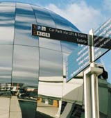
‘We need a bit of common sense,’ says Fendley, whose Bristol Legible City work while at MetaDesign London, is held up as an exemplar of what co-ordinated design can achieve.
‘Everything being British Rail and state-run was too far one way. And everything being split up, with Virgin branding its own platforms, is too far the other way. A balance has to be negotiated. There should be some way in which to present information in a consistent manner, [so] you don’t have to learn a new language [with every journey].’
Since most initiatives – such as Centro’s network – are likely to be voluntary, design interventions have to benefit the bottom line. Fendley is confident that Bristol makes a persuasive case – if not immediately then certainly in the medium term.
Changing the physical environment is the next step. The IIID conference discussed how the design of Heathrow Terminal 5 has been adapted to take account of mobility patterns, and the Design Council has taken up CfIT’s theme of ‘liveability’.
‘User-centred’ strategies can deliver a healthier and ‘self-sustaining’ system, it claims, advocating not so much off-the-shelf products as a shift in methodology, to bring design considerations into the equation much earlier.
Ambitious? Sure, but at least the emphasis on ‘interchanges’ offers a slogan for its new direction – ‘from modes to nodes’.
Information design: the basics
- Work from the passenger’s viewpoint: understand what they worry about, then work out your strategy. People only tend to notice when it’s not right
- Keep it simple: no more than is required. Consider the character of a place
- Reassurance: never underestimate value of reassuring people that they’re going in the right direction. Remember how humans tackle lists of information. Keep it to three or five items – people don’t see beyond that
Source: Tim Fendley

- Design disciplines in this article
- Industries in this article
- Brands in this article


