Op ‘t Oog, by WeWantMore
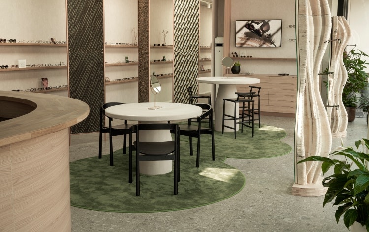
Antwerp-based studio WeWantMore has designed a retail space for Belgian start-up optical dispensary Op ‘t Oog, with a focus on sustainability and testing future materials – in this case, mycelium. WeWantMore collaborated with Blast studio in London to create two “out-of-this-world” columns, which are 3D printed out of recycled paper coffee cups sourced from London streets.
These solid paper structures then serve as the base for mycelium skin to grow onto, resulting in a durable, sustainably sourced and multipurpose interior furniture piece. The cellulose acetate plates in the display wall were handmade by Italian company Mazzucchelli 1849, using a material similar to that used to make the eyewear.
This project was not WeWantMore’s first time using mycelium, as it previously designed and created The Mush Room bar, made entirely out of mycelium for HIX 2022. WeWantMore founder Ruud Belmans says the studio is “testing the possibilities of integrating future materials like mycelium into an actual retail environment”.
Ulla Johnson Flagship, by Kelly Wearstler
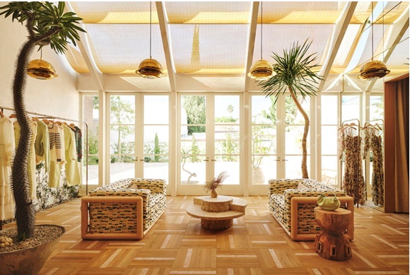
American designer Kelly Wearstler partnered with fashion designer Ulla Johnson to design her West Hollywood flagship store, with a Southern Californian, residential style in mind. Warm, tactile design elements from the 1970s and 80s come into play in the space, complimented by more modern works from some of Wearstler and Johnson’s favourite LA-based artists.
At the entrance, shoppers are greeted by an inviting and spacious atrium with a sunlit glow and soft colour palette, followed by an open-plan seating area, designed to accommodate and encourage conversation. With the mountainous Californian landscape visible from the store windows, Wearstler opted to continue themes of the natural world in the store’s interiors with a grand glass sunroom at the rear of the store, filled with leafy plants sourced from local Malibu nurseries and a 16-foot Brachychiton tree spanning both floors.
Other highlights include a sculptural resin centre-table by LA-based Ross Hansen, a collection of colourfully joined jigsaw tables by Canadian artist Jeff Martin and a series of three sconces by Olivia Bossy. These contemporary commissions are presented alongside a range of unique vintage finds, such as a set of 1970s Cornaro armchairs and Ingo Maurer’s Uchiwa wall lights.
Sam’s Waterside, by DesignLSM
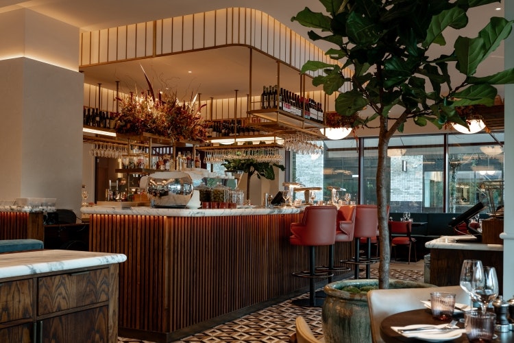
DesignLSM recently designed the interiors for Sam’s Waterside in Brentford, a new restaurant and terrace that continues similar concepts from its sister site in Hammersmith, designed by the agency in 2019. The interiors look to celebrates the backdrop of the historical industrial architecture, with the imprint of the new contemporary Brentford development that is set to regenerate the community.
Blush pink and ivory leather dining seats and the bespoke large Art Deco-inspired pendant lights which create defined ceiling statements are some of the design features taken from the original concept and integrated into the interior scheme for Brentford. These have been fused with slightly more industrial aesthetics, such as oxidized corten steel, raw concrete tones, and rough plaster, all used in the finishes and framework to nod to the manufacturing history of the Brentford.
The island bar is at the restaurant’s focal point, with a warm stained ash wood bar front bar front and arabascato marble counter and brass and opal tiered frames suspended above. The kitchen pass is highlighted by a curated frame of antique mirror and corten steel while teal velvet banquette seating provides guests with views of the natural waterside.
Akara, by A-nrd Studio
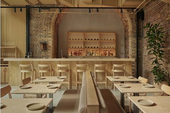
A new West African restaurant from Aji Akokomi has opened in arches of Borough Yards, with interiors designed by A-nrd Studio and inspired by “nothingness”, with a focus on materiality and simplicity. The studio sought to reduce the impact of the project by re-imagining existing features, the exposed brick walls in particular.
Together with a polished concrete floor, the brickwork provides a textural blank canvas for a restrained material and colour palette of neutral tones and natural and organic materials. Akara’s statement cocktail bar designed by A-nrd Studio features a unique carved oak wood façade chosen to contrast with the smooth white limestone skirting and chunky countertop surface. In line with the brief of “nothingness”, decor is minimal with plants around the space adding accents of colour.
This monolithic bar is carefully balanced by a minimalist back bar nestled inside an arched alcove, with a limewashed plaster finish on the wall, oak shelving designed by the studio with interlocking design details displays a selection of spirits and handmade ceramics. Seating includes a mix of custom square and circular tables with white limestone tabletops and steel framed legs paired with bespoke upholstered benches, greige toned leather upholstery and oak dining chairs with natural woven seats.
Caravan, by Other Side
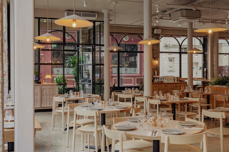
Caravan and Other Side looked to imbue a strong connection to the rugged landscape of the Pacific coastline in this space, harking back to Caravan’s New Zealand roots. Sandy, weathered finishes are layered with greenery and organic materials such as hemp and stone throughout the space.
The building’s rich industrial heritage and former use as a grain store and metal foundry also inspired the studio, which opted to leave its original brick, render, steelwork and metal frames exposed. References to the building’s history can also be found in its palette of yellow, mustard and earthy, pared back colours, simultaneously connecting it to the Pacific landscape.
Dark Belgian Blue limestone, with exposed fossils and shells naturally carved into its surface sits atop Caravan’s eight-metre-long feature bar, complete with a straw-like, compressed hemp panel bar front made with 100% natural fibres. Other Side worked closely with rustic furniture company Forest To Home to design feature tables that are handcrafted in Wiltshire, using materials sourced from a local sawmill.
Four slices of English Character Grade Oak form the large communal tables while the mid-height coffee table has a ‘live’ edge, revealing its natural beauty. Paving slabs of natural Quartzite stone in a mix of shapes and sizes adorn the restaurant’s floor and flow through from the entrance, featuring stones that were carefully selected to suit the interior colour palette of golden honey hues.

- Design disciplines in this article
- Industries in this article
- Brands in this article


