Justified Studio has developed a new identity for greengrocer Natoora, utilising “bold typography”, “contemporary accent colours” and “organic hand-rendered details” to communicate its in-season-only produce offer.
Natoora’s goal is to change the food system by working with farmers and only selling in-season produce. Justified Studio founder and creative director Josh Ogden explains how “intensive farming practices prioritise high yields over full flavour” and that consumers have come to “expect certain fruits and vegetables all year round”, -which isn’t good for people or the planet.

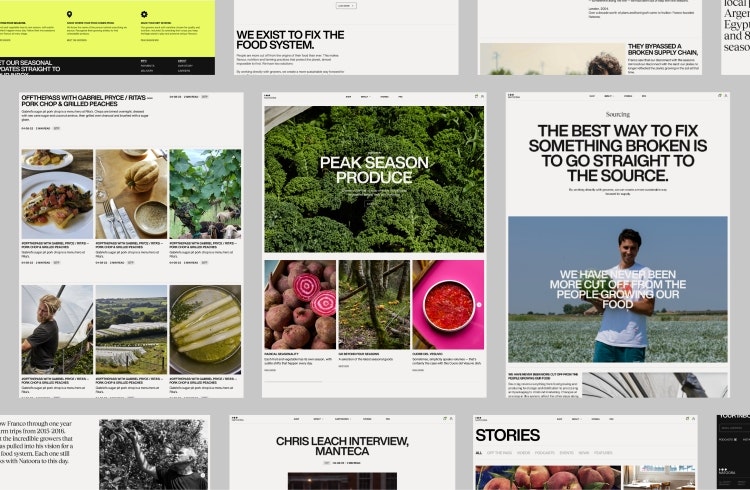
When the studio was invited to pitch, the initial request for proposal invovled “updating the marketing site”, but as Justified Studio became involved “the brief became much larger”, says Ogden. The project ended up comprising a new brand identity and the development of an e-commerce platform, as Natoora had not yet broken into the direct-to-consumer market.
To align with Natoora’s unique selling point, Justified Studio sought to create “a different buying experience” that matched the brand’s “distinctly different way of thinking about food”, according to Ogden. Natoora previously worked with chefs and restaurants and in moving to the consumer market, its offer comprises curated selection boxes of seasonal produce.

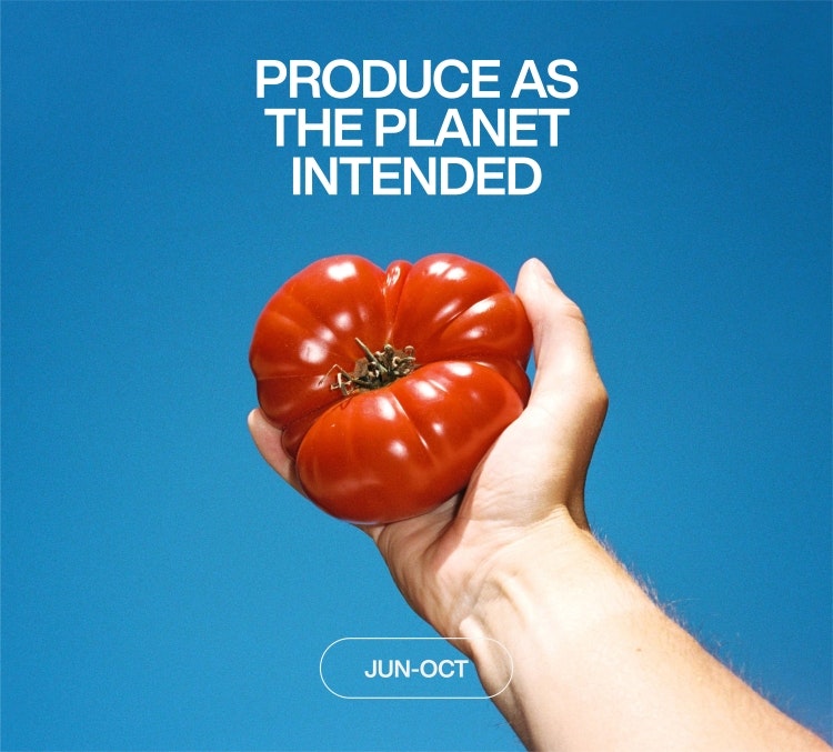
Ogden says this model “allows consumers to explore more and experience the joy of produce as the planet intended”. In a bid to keep customers coming back, enabling a more lasting effect on their food-buying habits, Natoora introduced a subscription service. The studio integrated a signup button into the checkout design, positioned to “highlight the offering and make sure it was simple and convenient for customers to sign up to”, says Ogden.
Natoora needed its brand to speak to “farmers, top restaurants and conscious consumers alike”, so Justified Studio’s devised a visual approach that aims to balance “human and luxe characteristics”, centred around the idea of “produce as the planet intended”, Ogden explains. This involved bold typography, “contemporary accent colours” and “organic hand-rendered details”, he adds, making a “simple and pared-back” identity that allows “the quality of the produce to speak for itself”.
Recommended: Wolff Olins repositions US instant grocery brand Instacart

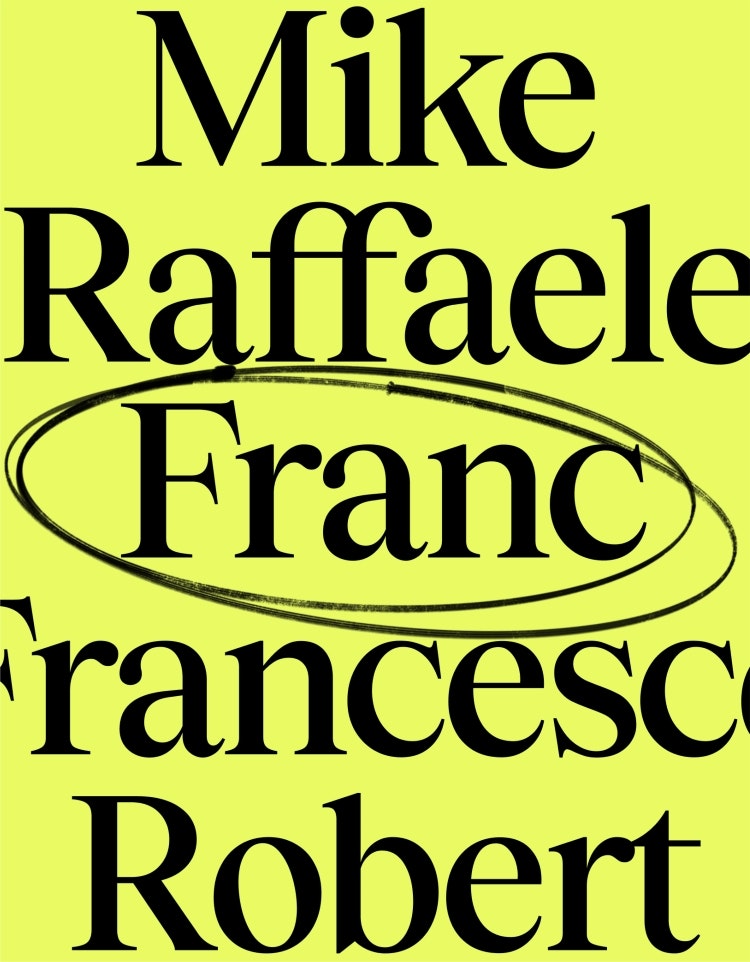
The brand’s headline typography combines sans serif Helvetica Now with serif Tobias. Ogden says this mixture of bold and elegant” was chosen to create “a striking aesthetic” that conveys “a disruptive attitude with a human touch” as well as “a sense of sophistication and curation”.
Showcasing Natoora’s relationships with its partners, its “attention to detail” and “the unparalleled transparency of its supply chain” was also important, so Ogden says the studio design a typographic device that highlight the growers “who nurture the produce” as well as “where and when it is seasonally grown”. Elements in the typographic system “can be dialled up or down” for varying applications, he adds.
Recommended: Online supermarket Weezy’s new visual identity is inspired by grocery stores

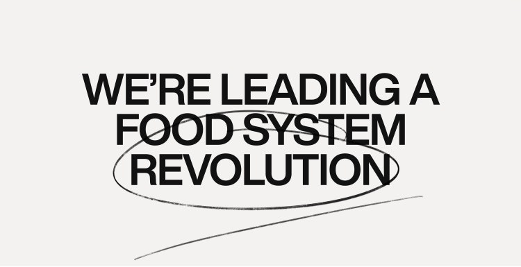
“Organic” hand-rendered marks seek to communicate “the raw energy of a revolution” while illustrating “the importance of the grower’s touch”, according to Ogden. Justified Studio opted for a “pared-back” black and white palette for the brand, accented by an “energetic yellow” that Ogden says “defies the expectations of the category and shifts the brand perception to feel premium but not pretentious”.

- Design disciplines in this article
- Industries in this article
- Brands in this article


2 responses to “Natoora looks to grow food system revolution with new identity”
Who came up with the line ‘…as the planet intended’ ? That’s really good.
Hey Derek, we did at a Justified!