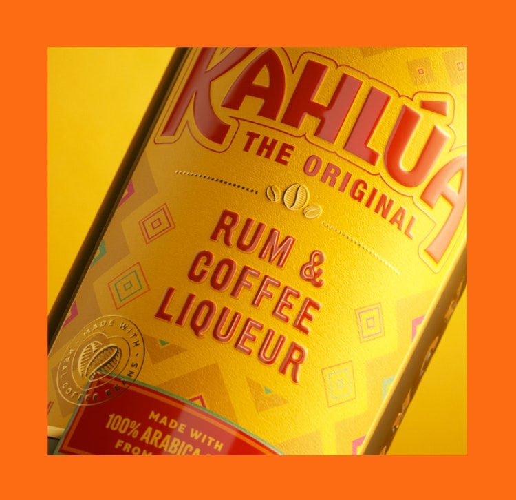
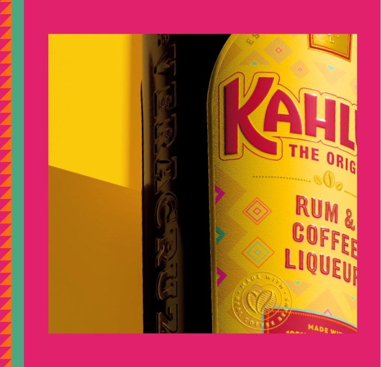
Pearlfisher has redesigned coffee liqueur brand Kahlúa in a bid to unify the UK and US designs and strike a balance between signifying its Mexican heritage and coffee flavour.
While Kahlúa had recently undergone a rebrand, it hadn’t seen as much success in the US – its biggest market – as it had in the UK, according to Pearlfisher senior strategist Millie Rowe. However, the work that Pearlfisher did on the brand “wasn’t just a touch-up”, says Rowe, it was a “comprehensive overhaul” that covered its visual identity, strategic vision, and brand and packaging design. Following the recent “global shift towards home-bartending”, Kahlúa felt it had to become more versatile and “re-assert its iconicity”, Rowe reveals.

Previously, it had two separate bottle designs: a UK and US version. Pearlfisher creative director Jess Phillips believes the former had become “too coffee-heavy in its aesthetic”, while the latter “overly played on its heritage”, so Pearlfisher set out to devise “one harmonious design” for a global market.
Kahlúa’s previous wordmark had lost its “sense of playfulness”, says Phillips, and instead appeared “formal and coffee-centric”. The new, modified logotype sees the coffee bean removed as the accent on the U, additional weight added to the letterforms and a slight leftwards slant on the A’s in a move to add “character” into the design, Phillips adds.
She identifies Kahlúa’s “iconic arch label and unique bottle structure” as the brand’s most recognisable assets, which is why they have been retained. Significant changes were made to the label design, such as “streamlining the on-pack copy and allowing key elements to shine without competing for attention”, says Phillips.
Recommended: Buddy Creative designs sand-pattern-inspired bottle for Connie Glaze Vodka
The UK version previously had “lots of lines, grids, and competing text” and the US version was too focussed on heritage, Phillips explains, adding that “both resulted in a somewhat confusing and disconnected messaging approach”. She says the new design aims to position Kahlúa as “The Original” coffee liqueur, a phrase which has been incorporated into the logo lockup, while the brand’s crest now appears in gold foil to further enhance its shelf presence.
Kahlúa’s new messaging was chosen to better communicate its use of 100% real coffee beans and, as the bottle is picked up, consumers will see phrases like “Stirring it up since 1936!” as well as cocktail making details on the back of the bottle label.
Recommended: This alcohol-free spritz “eschews the embellished codes” of its category

Its Mexican heritage still plays a part in the new identity, coming through in geometric patterns which take influence from Mexican fashion, art, and the geometry of its architecture but with “a modern twist”, according to Phillips. The patterns have been applied in vibrant shades of pink, turquoise and orange – colours inspired by modern Mexico – which look to “enrich the overall backdrop of the bottle label and add an exciting visual dimension and detail for the Kahlúa brand”, says Phillips.

- Design disciplines in this article
- Industries in this article
- Brands in this article


