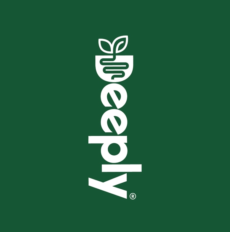
Family and Friends has devised the name and visual identity for gut health brand Deeply, featuring bespoke hand-drawn lettering and a nourish bowl icon, which doubles up as a D.
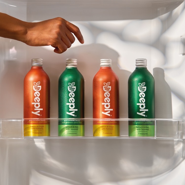
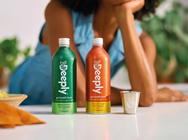
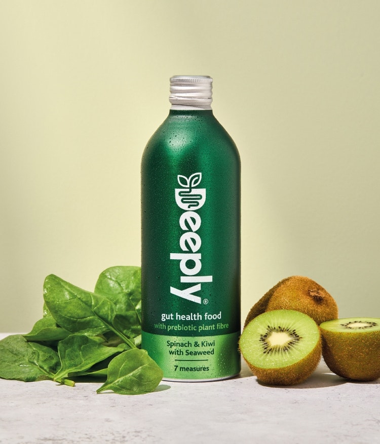
Deeply drinks come in two varieties – spinach and kiwi with seaweed, and carrot and ginger with turmeric – each containing a blend of natural plant fibres, fruit and vegetable extracts with natural prebiotics. Prebiotics feed good gut bacteria, helping build a strong gut microbiome, according to Deeply.

Family and friends co-founder and strategy lead Derek Johnston says the brief was simple: “create fame for a new category in gut health”. After running a series of internal brand workshops, the studio developed some working concepts for names, descriptors and packaging designs and conducted research with target consumers in a bid to find “a unique proposition”, according to Johnston.
He identifies Deeply’s use of plant-based prebiotics as its “game-changing” quality, as “nearly every other gut benefit product” relies on dairy, or probiotics. Johnston says Family and friends sought to emphasise this distinctive “deep-rooted, genuine health benefit that works deep inside your gut”, opting for the name Deeply, “for all its intuitive obviousness”.

The name appears vertically in bespoke, hand-drawn lettering across the identity, with the Nourish Bowl icon embedded in the D at the top. Through a series of trial consumer focus groups, Family and friends tested identities with “a lot of energy”, some with “more zen”, and other with “a greater sense of foodiness”, Johnston explains.
He describes the mark as “unique and ownable”, adding that it conveys the idea that the drinks are packed with “real food” through the bowl shape. “The plant-based ingredients literally look as though they are entering the gut within the entirety of the symbol and wordmark”, says Johnston.

The symbol was designed so that, when de-coupled from the wordmark, it can act as a short-form icon for plant-based food.
Being a heath focussed brand, Deeply wanted to promote both human and planet health. From the start, Johnston says it was decided that “plastic would not touch a drop of Deeply” and so its packaging system comprises infinitely recyclable aluminium bottles.
He adds that the secondary paper label was also omitted as Family and friends sought to achieve “a sleek finish” using aluminium substrate with ink applied directly to it. Ensuring the bottles were carefully packed for delivery was crucial as aluminium can dent easily, so the studio designed cardboard outers to protect the bottle.

Being careful to avoid “too many benefit messages and front of pack symbols”, Johnston explains how Family and friends aimed to design a bottle that would stand out on the shelf and in the fridge. “It needed to look elegant and part of your home styling, not like an FMCG pack shouting on shelf”, he says.
For the colour palette, the studio chose hues that would reflect the flavours, “being single minded” with its choices to convey “a sense of factuality, whilst aiming to be iconic and memorable, like Coke”, Johnston adds.

- Design disciplines in this article
- Industries in this article
- Brands in this article


