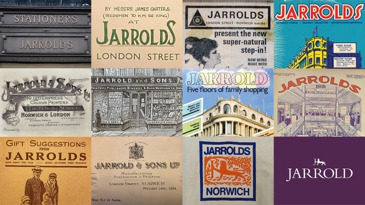
The Click has rebranded independent, family-run department store Jarrolds, with an updated lion logo featuring hidden, hand-drawn Js in the character’s legs.
The Norwich-based business worked with The Click in 2019 on a naming, identity and packaging project for its first own brand range of food and drink. Jarrolds contacted the design team again in early 2022 looking to “move the store brand forward” while “retaining its heritage and building upon existing brand equity”, says the studio’s design director Adam Ewels.

After exploring the brand’s heritage, looking through archive materials, and carrying out competitor research, Ewels says the studio devised “a written brand story” for the client to inform the visual approach. Early on, it was clear that the lion symbol “contributed a huge amount of brand equity”, he adds.
In 1938, two heraldic lions were made by sculptor Alfred Hardman to celebrate the official opening of Norwich City Hall, which is located just across the marketplace from the facade of Jarrolds’ flagship store. Over 50 years ago, Jarrolds adopted Norwich’s civic lion to use in its own logo.
In its former use, the lion was leaning its front leg against the stem of the letter J. This caused some confusion because, when viewed small, it was mistaken for a capital H, according to Ewels. To resolve this, The Click completely redrew the lion and the J and integrated the letter into the body of the big cat.
Ewels describes it as “a clever detail that can be fused across multiple logo variations”, creating a synergy between the logomark and logotype. He adds that the new design is “modern and geometric” with “increased negative space around key forms”, such as the lion’s tail, legs.
While the J was hand-drawn, a traditional, characterful serif called Lapture is used for the rest of the wordmark. Its predecessor was thin in places and had “awkward kerning issues between the capitalised R’s”, so the studio sought a font with “more weight and warmth” that comes across as “premium and sophisticated”, Ewels explains. The Click also decided to ditch the all-caps style for title case, which he says is “welcoming and less dated”.
The rebrand has seen the name pluralised, as it was previously called Jarrold. The company was founded by John Jarrold in 1770, later becoming Jarrold & Sons and now, eight generations of the Jarrold family have worked in the business. The family history, the fact that Jarrolds “sounds more friendly” and that its locally known as Jarrolds anyway, led to the change, says Ewels.
Minimal changes have also been made to the colour palette which features hero shades of purple and blue. The now-deeper purple aims to portray luxury while the Verdigris Blue pays tribute to Hardman’s bronze lion statues that have become discoloured by atmospheric oxidation. The blue hue was previously greener, according to Ewels, but The Click chose to better align it with the blue used in Jarrolds’ Our Type of Food range and name it after the bronze lions.
New brand guidelines define that the two hues should only be used separately, with the Jarrolds Purple paired with white and the Verdigris Blue with black, to achieve “optimum legibility and provide more flexibility in application”, Ewels reveals.
Drawing on Jarrolds’ history as a printer and publisher in the 19th and 20th centuries, The Click developed a range of ink-inspired artworks. These will feature across points of sale, advertising and brand awareness campaigns.

- Design disciplines in this article
- Industries in this article
- Brands in this article


