
London’s University of Roehampton has been rebranded with a new logo split into four parts that aims to represent the university’s four colleges.
The University of Roehampton is based in South-West London and is made up of four colleges: Whitelands, Southlands, Digby Stuart and Froebel.
Whitelands College is the oldest part of the university, and was founded in 1841 as a training centre for female teachers and headmasters. It was the first higher education college in the UK to accept women.
The other three colleges followed later in the 19th century, and the university was named Roehampton Institute of Higher Education in 1975.
It was later renamed Roehampton University in 2004, reflecting how it no longer offered only teacher training courses. It was then rebranded the University of Roehampton in 2011. The university now offers undergraduate and postgraduate courses in a range of subjects, from sciences to humanities and the arts.
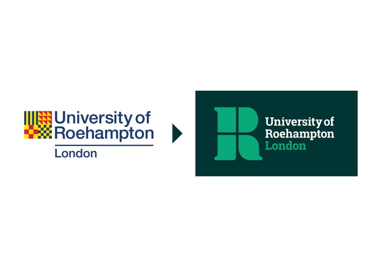
Taxi Studio has rebranded the university, scrapping the previous logo which consisted of a yellow, square icon split into four, with four different dark blue and red patterns within it. The university name sat to the right in dark blue.
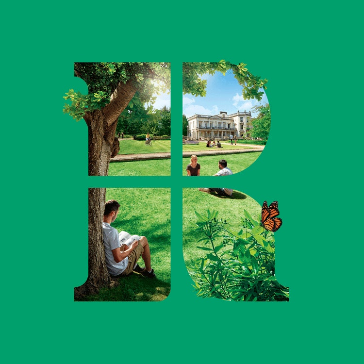
The new logo sees an “R” icon segmented into four parts in light green, with the university name set in a serif typeface to the right. A light green, dark green and white colour palette replaces the dark blue, red and yellow one seen previously, to reflect the university’s “green campus”, says Taxi Studio.
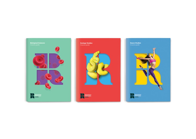
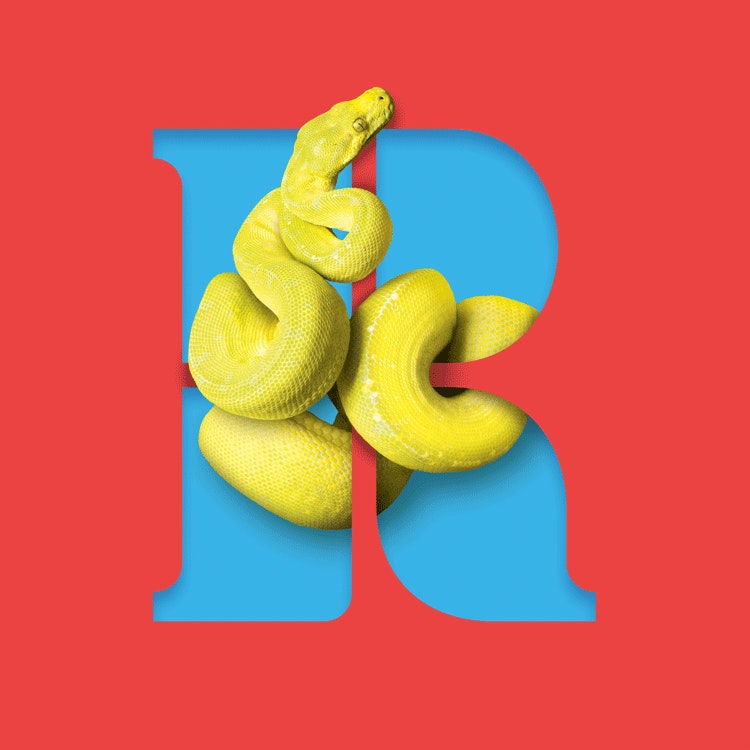
The “R” is used as a holding device for various images to represent the different courses and research conducted at the University of Roehampton. This includes red blood cells to represent biological sciences, a female dancer to represent dance studies and a snake to represent zoology studies.
A new colour palette has been used across print communications, of green, purple, yellow, red and blue.

The logo’s use as a holding device for imagery aims to act as a “window” to allow people to “look into the world of Roehampton”, says Taxi Studio, and aims to make the branding more “interactive”.
The new branding aims to be a “contemporary” update for the university, adds the studio, and “cut through the [many] generic crests” owned by higher education institutions.
The studio collected research and insight from students, staff and the board of directors at the university when designing the new identity, it says.
The University of Roehampton’s new visual identity is currently rolling out across print communications, online, interiors and signage and merchandise.

- Design disciplines in this article
- Industries in this article
- Brands in this article


3 responses to “University of Roehampton rebrands to be more “contemporary” and less “generic””
Besides the inner shadow, this is great.
Totally agree, that shadow is pretty horrendous.
It certainly wasn’t generic when Trickett & Webb designed it 30+ years ago, pretty contemporary too! Each of the four modern heraldic elements represented a specific part of the four original teacher training colleges coming together to form a new entity…