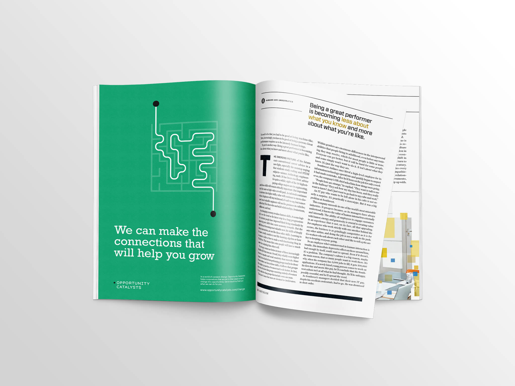
SomeOne has branded Opportunity Catalysts, a firm which helps corporations find new business opportunities and grow.
OC was set up to help organisations identify new opportunities, realise them or do both.
The concept behind both the branding and the business is corporations turning change into an opportunity.
Typeface as “badgeless branding system”
SomeOne lead designer Andy Jackson says that a typographic solution has been sought, which creates “a clear line between starting points” so that the typeface can act as a “badgeless branding system.”
Jackson says: “The offer is finding simplicity surrounded by complexity. Getting things done is easy if there are no obstacles — what the OC team do so well is finding the clearest path between the starting challenge and the desired outcome. We dramatised that path with the new visual identity.”
Hidden messages
In some versions of the branding the dots, which make up the grid are initially illegible.
“The message is always there but it’s only when the lines appear you know what it is,” says Jackson.


- Design disciplines in this article
- Industries in this article
- Brands in this article


