It seems like across sectors, a lot of parent brands, with well-known names under their umbrella, are looking to increase their own presence.
That was the challenge for Bristol-based Fiasco Design, which was tasked to create a new identity and website for Nederlander Theatres.
You may not have heard of Nederlander, but you’ve almost certainly heard of their three famous West End theatres – The Dominion, The Aldwych, and The Adelphi (which they co-own with LW Theatres).
“The challenge was to craft a modern identity that honours their rich heritage and prestige, while shining a spotlight on the exceptional experiences the venues offer,” says Fiasco’s Creative Director, Chris Tozer.
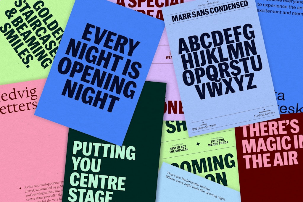
The Fiasco team built around the idea that “every night is opening night” which became a promise to recreate the “magic of live theatre” on every visit, a neat combination of quality and consistency.
As part of the work, they created a new website focused on improving user experience to drive more ticket sales. “Each theatre is codified to highlight the unique qualities of its venue, and a two-tier navigation system allows users to delve deeper into specific theatre and venue information,” Tozer says.
“With clearer navigation, important details are now more accessible, making the entire experience smoother and more intuitive.”
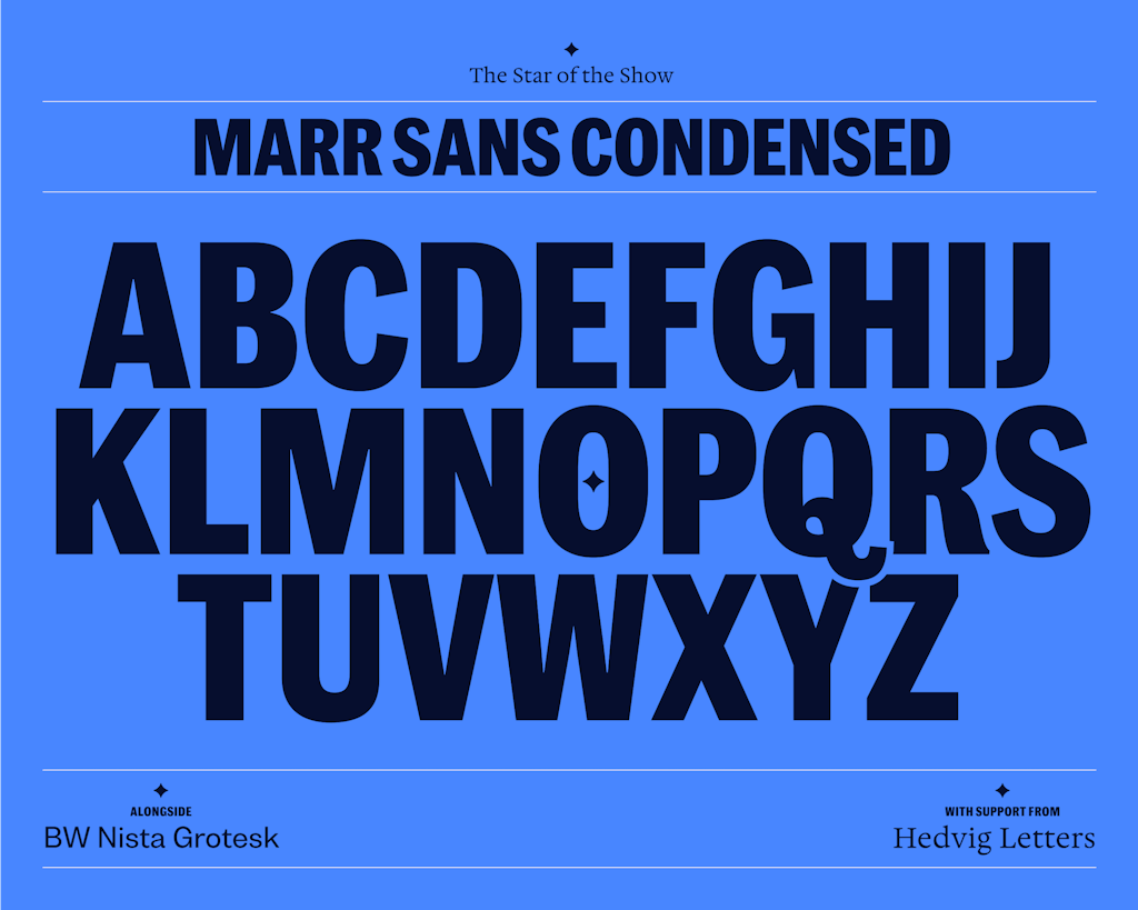
The team used Commercial Type’s Marr Sans Condensed for the main headlines, with BW Nista Grotesk for the supporting copy and Hedvig Letters for serifs.
Key decisions
Taking visual cues from the buildings
Inspired by the beauty of the Art Deco and Edwardian theatres in the Nederlander group, the team looked for ways to capture and communicate that aesthetic and its sense of history.
“We chose a modern typeface that nodded to existing signage and created a graphic system that was directly born from the shapes found within the theatres – be that the plasterwork or the intricate ceilings,” Tozer says.
Assets that combine grandeur and authenticity
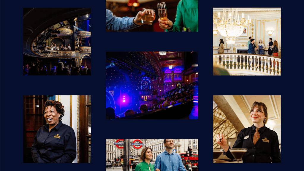
“To capture the essence of the ‘Nederlander experience,’ we defined an art direction that is atmospheric and energising,” Tozer explains.
The team commissioned Nic Kane to “show off each theatre’s best bits” and create a library of photo and video assets, “ that highlight the unique spaces, great people, and ambience that make each experience memorable.”
Designed to be versatile, this content is used across the new website and social media channels as well as in print and on signage.

Connecting the main brand and the sub-brands
As ever with these projects, the key to success was striking the right balance between promoting the overarching brand without diminishing the sub-brands – in this case the three theatres.
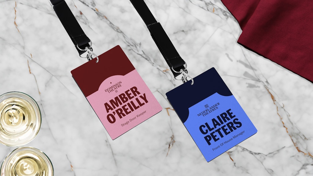
“We needed to create a brand architecture and two-way relationship that improved the equity for all brands,” Tozer explains. To do so, the team introduced the endorsement line, “A Nederlander Experience.”
“Other elements helped to bind the brands together including a colour coding system, a graphic device system and of course the use of the N monogram that had to remain unchanged,” Tozer says.


- Design disciplines in this article
- Industries in this article
- Brands in this article


